Table of Contents
- Introduction to Color Psychology
- Historical Context of Color in Architecture
- The Emotional Impact of Color
- Color Theory and Its Application in Design
- Case Studies: Successful Use of Color in Architecture
- Cultural Considerations in Color Choices
- Trends in Color Usage in Modern Architecture
- Challenges and Considerations in Color Choices
- Conclusion: The Future of Color in Architecture
Introduction to Color Psychology
Color psychology is a fascinating interdisciplinary field that examines how different colors can evoke specific emotions, perceptions, and behaviors. This area of study is particularly relevant in fields such as marketing, art, and, notably, architectural design. Colors are not merely aesthetic choices; they possess the power to influence human comfort, safety, productivity, and mood, thus playing a crucial role in the experiences individuals have within various environments.
The significance of color extends beyond mere visual appeal. It impacts cognitive and emotional responses, shaping the way individuals perceive space. For instance, warm colors such as reds and oranges can evoke feelings of warmth and excitement, while cooler colors like blues and greens are often associated with tranquility and calmness. Understanding the psychological effects of colors enables architects and designers to strategically select hues that align with the intended purpose of a space and the emotional responses they wish to elicit from its occupants.
In architectural design, the application of color psychology can enhance functionality and aesthetics, making environments more conducive to various activities. For example, vibrant colors in educational facilities may stimulate creativity and engagement among students, while muted tones in healthcare settings promote calmness and healing. By carefully considering the psychological implications of color, designers can create spaces that not only fulfill practical needs but also enrich human experiences.
This foundational understanding not only highlights the relevance of color in architectural contexts but also sets the stage for further exploration into how color selections can evoke specific feelings and responses. As we delve deeper into this subject, it becomes clear that the thoughtful integration of color into architectural design ultimately contributes to the overall well-being and satisfaction of individuals within those spaces.
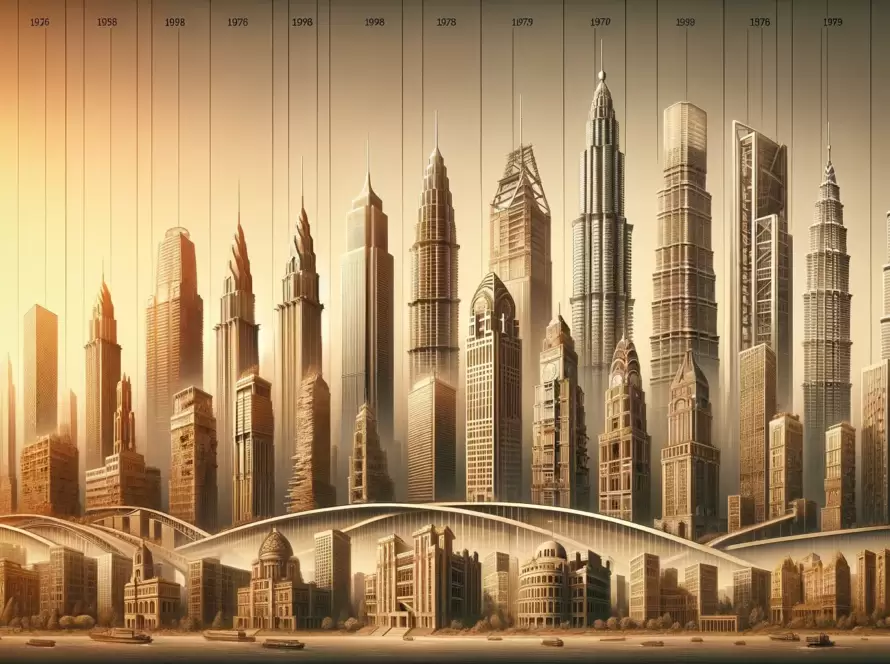
Historical Context of Color in Architecture
Color has always been a vital element in architectural design, with its significance evolving through various historical epochs. In ancient civilizations, such as the Egyptians and the Greeks, color was utilized not only for aesthetic purposes but also to invoke spiritual connections and represent societal values. The Egyptians adorned their temples and tombs with rich, vivid colors like lapis lazuli blue and deep red, symbolizing life, rebirth, and the divine. Conversely, in ancient Greece, the once vividly painted temples, like the Parthenon, have now faded, leading to a preoccupation with white marble and the ‘classic’ aesthetic in Neoclassical architecture.
During the Middle Ages, color in architecture often reflected the visually striking elements of Gothic style. The use of stained glass windows in cathedrals, such as Notre-Dame in Paris, created stunning displays of color that transformed light into a magical experience, showcasing biblical stories and glorifying divine presence. This emphasis on color was not just decorative but served an educational purpose, as many congregants were illiterate. Artistic movements like the Renaissance later revived harmonious color schemes, drawing from classical influences to enhance the beauty of buildings through balanced palate usage.
In modern times, the interpretation of color in architecture has taken on a new dynamic. With the rise of movements like Modernism in the 20th century, architects began to explore abstract color schemes that challenged traditional views. Notable examples include the Villa Savoye by Le Corbusier, which utilizes color to create a fluid interplay with architectural form. The Brutalist movement, conversely, often showcased raw concrete with an emphasis on texture over color; however, where color was used, it was strategically chosen to evoke feelings and moods, reflecting the surroundings and the human experience.
As one reflects on the historical context of color in architecture, the evolution of its applications distinctly mirrors cultural shifts, technological advancements, and artistic endeavors. Color choices today continue to be deeply informed by these historical precedents, demonstrating that architecture is not just a silent structure but a storyteller shaped by time and context.
The Emotional Impact of Color
The relationship between color and emotion is profound and has been the subject of various studies across disciplines, including psychology and design. Different colors elicit distinct emotional responses that can significantly influence an individual’s perception and experience within a space. For instance, the color blue is often associated with calmness, tranquility, and reliability. Spaces adorned with blue hues can foster feelings of serenity and reduce anxiety, making it an excellent choice for areas meant for reflection and relaxation, such as bedrooms or meditation rooms.
Conversely, red is linked to excitement and energy, often stimulating passion and action. This bold color can incite feelings of warmth and an increased heart rate, making it a popular choice for social environments such as dining areas or entertainment venues. However, it is crucial to balance red’s stimulating nature; excessive use can lead to feelings of agitation. Green, on the other hand, promotes renewal and harmony, representing growth and vitality. Its association with nature can provide a restorative quality to spaces, making it ideal for offices or healthcare environments where calmness and healing are paramount.
Interestingly, the emotional response to colors can vary significantly across different cultures. For example, while white conveys purity and simplicity in Western cultures, it may symbolize mourning in some Eastern cultures. Such cultural nuances highlight the importance of understanding the intended audience when selecting colors for architectural design. Architects must consider these emotional associations along with cultural interpretations to create environments that resonate positively with their users. By strategically employing colors that align with the desired emotional responses, architects can craft spaces that enhance well-being, productivity, and overall user satisfaction.
Color Theory and Its Application in Design
Color theory serves as a foundational element in the realm of architectural design. Comprising principles and guidelines that govern how colors interact, color theory utilizes the color wheel, which categorizes colors into primary, secondary, and tertiary groups. Primary colors—red, blue, and yellow—are the building blocks for creating a plethora of other colors. Secondary colors, formed by mixing primary colors, include green, orange, and purple. Tertiary colors arise from combinations of primary and secondary hues, yielding shades such as red-orange and blue-green.
One essential aspect of color theory is color harmony, which refers to the aesthetically pleasing arrangement of colors. Various schemes, such as complementary, analogous, and triadic, can significantly influence the aesthetics and emotional impact of a space. For instance, complementary color schemes utilize opposing hues on the color wheel, creating dynamic contrasts that can energize a space. Likewise, analogous colors, which are adjacent on the wheel, evoke a sense of harmony and cohesiveness, contributing to a serene atmosphere. Triadic color schemes involve three evenly spaced colors on the wheel, promoting vibrancy while maintaining balance.
Incorporating these theories in architectural design not only enhances visual appeal but also plays a vital role in influencing human psychology. Colors have the power to evoke emotions, stimulate thought, or even alter perceptions of space and scale. For example, warm colors such as red and yellow can create feelings of warmth and comfort, making them suitable for communal areas like living rooms. In contrast, cool colors such as blue and green often instill tranquility and spaciousness, ideal for environments intended for relaxation or concentration.
Thoroughly understanding color theory enables architects and designers to make informed choices that cater to both aesthetic desires and psychological needs. This interplay of color and design fosters environments that resonate with occupants, ultimately enhancing their experience and satisfaction.
Case Studies: Successful Use of Color in Architecture
Color plays an integral role in architectural design, not only enhancing the aesthetic quality of structures but also influencing the behavior and emotional responses of those who occupy or visit these spaces. Numerous case studies highlight the strategic use of color in architecture, showcasing how thoughtful application can elevate design and functionality.
One significant example is the Centro Botín in Santander, Spain, designed by architect Renzo Piano. This cultural center utilizes a bold palette of color both on its exterior and within its interiors to engage visitors emotionally. The soft pastel tones of the building facade reflect the surrounding environment, harmonizing with the coastal landscape while inviting natural light into the interior spaces. This use of color fosters a sense of calm and creativity, encouraging visitors to interact with the art installations and each other, thereby promoting social engagement.
Another compelling case study is the Vitra Fire Station in Germany, designed by Zaha Hadid. The stark white exterior contrasts with splashes of bright color used within the interior spaces. These vibrant colors are not only visually striking but also serve to energize the functional spaces, enhancing the experience of both firefighters and visitors. The deliberate choice of color reflects the innovative spirit of the fire station while creating a dynamic atmosphere that encourages productivity and collaboration.
Moreover, the Brighton Marina in the United Kingdom illustrates the influence of color in a community-focused architectural project. Its colorful waterfront buildings were designed to evoke a sense of nostalgia and delight among families and tourists. The vibrant exteriors not only draw attention but also create a cheerful ambiance, enhancing the overall experience of the marina, as visitors engage with shops and restaurants along the waterfront.
These case studies exemplify how the strategic use of color in architecture can profoundly impact aesthetics, functionality, and the emotional connections forged between occupants and spaces. Each project demonstrates that a well-considered color palette is not merely decorative but a vital component that enriches the architectural narrative.
Cultural Considerations in Color Choices
Color plays a vital role in architectural design, serving not only aesthetic functions but also evoking emotions and cultural associations. Recognizing that color perception varies significantly across different cultures is crucial for architects aiming for culturally responsive design. For instance, while white is often associated with purity and peace in Western nations, it can symbolize mourning and loss in various Eastern cultures. This divergence highlights the importance of incorporating cultural contexts into color choices during the design process.
In various Asian cultures, colors carry profound meanings. Red, widely recognized as a symbol of happiness and good fortune in China, is often used during celebrations and significant life events. Conversely, in some African cultures, color connotations can vary widely from region to region, where earthy tones might represent connection to land and community. The understanding that colors carry distinct meanings and emotional weights can inform architects’ decisions, ensuring that their selections resonate positively with the local population.
Furthermore, indigenous cultures present a unique perspective on color, often employing hues that reflect the natural environment and spirituality. For instance, colors that mimic the landscape—such as greens for lush foliage or browns for earthy tones—are utilized to create a harmonious relationship with nature. This practice promotes not only aesthetic coherence but also cultural identity. Recognizing such traditions is vital for architects working in these contexts, as an understanding of local symbolism can significantly enhance the cultural relevance of their designs.
Ultimately, culturally sensitive color choices can foster community connection and appreciation, ensuring that architectural projects are not only visually appealing but also deeply meaningful. By acknowledging the diverse interpretations of color across cultures, architects can enhance their designs’ impact and ensure they honor the communities they serve.
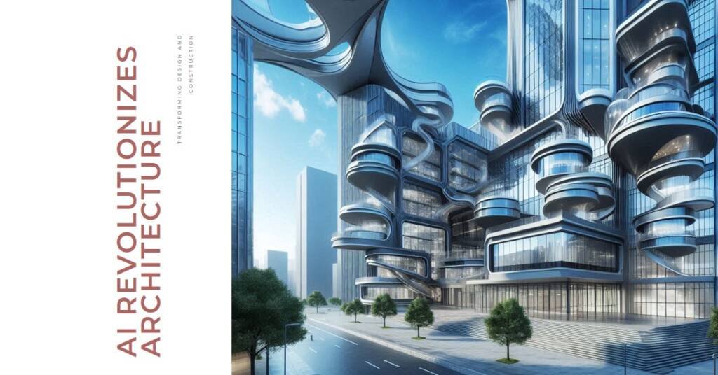
Trends in Color Usage in Modern Architecture
In the realm of contemporary architectural design, the use of color has evolved significantly, reflecting not only aesthetic preferences but also deeper psychological and environmental considerations. Modern architects are increasingly exploring bold palettes that defy traditional norms, creating spaces that resonate with vibrancy and dynamism. This shift towards audacious color choices often seeks to evoke emotions and establish a strong identity for buildings, setting them apart within their urban contexts.
One of the prevalent trends in modern architectural color usage is the incorporation of sustainable materials, which influences color selections. Biomimicry and eco-friendly finishes have brought about earthy tones and organic shades that harmonize with nature. These color choices not only enhance the building’s aesthetic appeal but also reinforce a commitment to environmental sustainability, with architects opting for hues that echo the surrounding landscapes. Additionally, this approach underscores a growing awareness of the psychological impact that colors can have on occupants, contributing to well-being and comfort in living and working environments.
Advancements in technology are further transforming how colors are utilized in architecture. The incorporation of smart technologies allows for dynamic color schemes that can adapt to natural light and the changing needs of occupants. For instance, smart glass and LED solutions enable architects to manipulate colors throughout the day, creating environments that can energize, calm, or inspire. These innovations are not only visually striking but also align with modern sensibilities, emphasizing flexibility and personalization in architectural design.
As a result, contemporary architects are harnessing a diverse range of colors and materials to convey narratives, evoke emotions, and respond to the changing values of society. The trends in color usage in modern architecture reflect a thoughtful consideration of both aesthetic and experiential dimensions, further establishing architecture as a field that continually adapts to the evolving cultural landscape.
Challenges and Considerations in Color Choices
The incorporation of color in architectural design presents a unique set of challenges and considerations that architects must navigate to create functional and aesthetic spaces. One significant factor is the impact of local climate on color choices. In regions with high sun exposure, certain colors can fade more rapidly, necessitating careful selection of durable materials and pigments that are resistant to UV deterioration. Architects should consider the thermal properties of colors as well, as darker tones may absorb more heat in warmer climates, affecting energy efficiency. Thus, balancing aesthetic appeal and environmental responsiveness is vital when choosing colors for a project.
Another critical consideration is the maintenance of color over time. Many buildings undergo changes due to weather conditions, pollution, and wear and tear. Color choices must account for the long-term visual impact, ensuring that they remain attractive and relevant throughout their lifespan. This aspect is particularly pertinent in establishing the building’s identity and relevance in the community. Employing high-quality finishes and materials that can withstand the elements can mitigate such issues, though they often come at a higher initial cost.
Psychological impacts of color also play a crucial role, especially when distinguishing between residential and commercial settings. In residential design, softer, warmer palettes are often favored to evoke feelings of comfort and tranquility, while commercial environments may leverage bolder, vibrant colors to stimulate productivity and creativity. Consideration of how color influences mood and behavior can help architects create spaces that meet the specific needs of their users. Cultivating an understanding of these diverse factors enables architects to select colors that not only enhance aesthetic appeal but also resonate with the occupants psychologically.

Conclusion: The Future of Color in Architecture
As architectural design evolves, so too does the role of color within it. The advancing technological landscape and shifting societal values are poised to significantly influence the application of color in architectural projects. Today, architects are increasingly recognizing that color is not merely an aesthetic choice but a vital factor in shaping the psychological and emotional responses of individuals to their environments. This acknowledgment lends itself to a more thoughtful approach to design, one that understands the power of color psychology in fostering wellbeing and enhancing user experience.
In light of this understanding, architects can explore innovative ways to integrate color into their designs. For instance, the use of intelligent building technologies that adjust lighting and color palettes in real-time could provide insight into user preferences and behavior. This advancement would enable architects to create dynamic spaces that adapt to the needs and moods of occupants, thus enhancing overall satisfaction. Additionally, the emphasis on sustainable practices in building design can lead to the exploration of natural pigments and materials, offering new dimensions to color use while promoting environmental responsibility.
Furthermore, as diverse communities continue to influence architectural trends, the understanding of cultural significance in color choices will become increasingly important. Architects must cultivate an awareness of how different colors can evoke distinct feelings and interpretations across various demographics. This awareness allows for more inclusive designs that celebrate cultural diversity and foster a sense of belonging within spaces.
By embracing the evolving psychology of color in architecture, professionals can enrich the human experience within built environments. As technology advances and societal perspectives shift, the effective application of color will remain a crucial element in creating transformative, welcoming spaces for all users.