Table of Contents
- Introduction to Understated Interiors
- The Importance of Color in Home Design
- Popular Neutral Color Palettes
- Incorporating Texture in Neutral Spaces
- Minimalism vs. Maximalism: Finding Balance
- Spotlighting Art and Decor in Neutral Settings
- 30 Stunning Homes Featuring Neutral Interiors
- Common Mistakes to Avoid in Neutral Interiors
- Conclusion: Embracing Understated Interiors
Introduction to Understated Interiors
The concept of understated interiors embodies the essence of simplicity and elegance in home design. This design philosophy emphasizes the use of neutral palettes, leading to spaces that convey tranquility and harmony. By harnessing the potential of a muted color scheme, homeowners can create an inviting atmosphere that reflects their personal style while adhering to contemporary trends.
Neutral colors, ranging from soft whites and beiges to muted grays and taupes, serve as the backbone of understated interiors. These tones not only promote a sense of calm but also encourage versatility in decor choices. A well-executed neutral palette can enhance natural light within a space, making it feel more expansive and cozy. Additionally, they provide a timeless quality, allowing for seamless integration with various design elements, textures, and accessories that can be easily swapped out as trends evolve.
Understated interiors cater to those who appreciate the beauty of simplicity, where each design choice is purposeful rather than ostentatious. This minimalist approach highlights the significance of form, texture, and function over flamboyant designs, elevating the overall aesthetic. It is a reflection of modern sensibilities, aligning with a growing appreciation for sustainability and mindfulness in living spaces. As society’s values shift towards creating environments that promote well-being, the allure of neutral palettes becomes more pronounced.
In this post, we will explore thirty exemplary homes that embody the principle of understated interiors, showcasing how these design choices can create serene and sophisticated living environments. Through these examples, readers will gain insights into the practical applications of neutral color schemes and their impact on overall home aesthetics.
The Importance of Color in Home Design
Color plays a pivotal role in home design, influencing not only aesthetic appeal but also psychological well-being. A neutral palette, composed of shades such as beige, gray, white, and taupe, serves as a versatile foundation upon which homeowners can build their desired atmosphere. The selection of colors can evoke different emotions and reactions; hence, understanding their impact is essential for creating harmonious living spaces.
Neutral colors are particularly favored in home design for their ability to create an inviting and tranquil environment. These hues have a calming effect, promoting relaxation and serenity, which is particularly advantageous in areas such as bedrooms and living rooms where individuals seek comfort after a busy day. By opting for soft, muted tones, homeowners can cultivate spaces that foster emotional well-being and reduce stress.
Moreover, neutral colors do not overpower other design elements, allowing for the incorporation of various textures and accents. They provide the flexibility to adapt to changing styles and preferences, making them a timeless choice for both contemporary and traditional interiors. Homeowners can easily introduce pops of color through decor, furniture, or artwork without overwhelming the space. This adaptability is one of the main reasons why neutral palettes are a prevailing trend in interior design.
Furthermore, neutral colors enhance the perception of space, making rooms appear larger and more open. Lighter shades can reflect natural light, creating an airy atmosphere. This characteristic is particularly beneficial in smaller homes or apartments, where maximizing space is often a priority. As such, the importance of choosing the right color scheme cannot be underestimated; it is essential not just for beauty but also for functionality and emotional impact.
In summary, the strategic use of neutral colors in home design plays a significant role in shaping mood, flexibility, and space perception, making them an integral element for homeowners aiming to create harmonious and welcoming living environments.
Popular Neutral Color Palettes
Neutral color palettes play an integral role in interior design, providing a versatile backdrop that allows for creativity while maintaining a sense of harmony. Among the most popular neutral colors, whites, beiges, grays, and taupes stand out. Each of these shades brings its unique characteristics and can be employed effectively to create a range of ambiances within a home.
Whites are often considered the most classic neutral. They can make spaces appear larger and more open, reflecting light beautifully. When selecting a white, it is essential to consider its undertone. A warm white might include hints of yellow or cream, making it an ideal choice for spaces where comfort and coziness are desired. Conversely, a cool white, infused with blue or gray undertones, brings a crisp and modern vibe that is perfect for contemporary designs.
Beige, often seen as a warmer alternative to white, offers nuanced depth to interiors. This earthy tone can be paired with various accent colors to infuse personality into a space. From light sandy beiges to deeper taupe shades, selecting the right beige can enhance the room’s features and textures. It often serves as a friendly backdrop for both traditional and modern furnishings.
Gray, with its myriad of shades ranging from soft dove to deep charcoal, is another staple in neutral palettes. Gray is highly versatile and can evoke sophistication or tranquility, depending on the saturation and accompanying decor. Ideal for living rooms and bedrooms, gray shades can serve as a neutral base that allows other elements of the room, such as artwork and textiles, to stand out.
Taupe serves as a bridge between gray and beige, offering a refined look with its muted tone. It is particularly effective in creating intimate spaces and can be layered with various textures, making it suitable for both contemporary and traditional designs. When incorporating taupe, consideration should be given to the lighting conditions, as different lights may alter its perception within a room.
Incorporating Texture in Neutral Spaces
When decorating a neutral interior, the goal is to create depth and visual interest without overwhelming the subtle aesthetic. Incorporating various textures is key to achieving this balance. By carefully selecting materials such as wood, fabric, and stone, homeowners can enhance the overall ambiance while maintaining a serene and understated environment.
Wood can serve as a foundational element in neutral spaces. Whether it’s through furniture pieces, flooring, or wall paneling, the natural grain and warmth of wood introduce an organic quality that contrasts beautifully with soft, muted hues. Lighter woods like birch or maple can brighten a room, while darker finishes such as walnut or mahogany provide richness and depth. Layering different wood tones can also contribute to the overall texture, creating a harmonious yet complex look.
Fabrics play another crucial role in adding texture to neutral spaces. Incorporating textiles like linen, wool, cotton, or velvet can significantly influence a room’s atmosphere. For instance, a plush velvet sofa can serve as a focal point, inviting warmth and comfort, while lightweight linen curtains can soften the harshness of sunlight, creating a tranquil environment. Additionally, mixing various fabric types, such as a chunky knit throw paired with smooth silk cushions, can create a tactile experience that draws people in.
Stone elements also lend a unique texture to neutral interiors. Whether through decorative accents, such as marble tabletops or stone tiles, these materials add sophistication and a natural feel. The cool surfaces of stones contrast with softer elements, helping to maintain a balanced aesthetic. Additionally, elements like exposed brick or stone walls can become striking features that celebrate the beauty of nature while remaining aligned with the understated theme.
Incorporating a thoughtful mix of these materials will not only enhance visual interest but also evoke a sense of comfort and tranquility, which is essential for any neutral space. By focusing on texture, homeowners can create inviting interiors that feel both modern and timeless.
Minimalism vs. Maximalism: Finding Balance
In the realm of interior design, minimalism and maximalism represent two distinct philosophies that influence how we approach our living spaces. Minimalism advocates for simplicity and the less-is-more mentality, while maximalism embraces abundance and personalized expression. When it comes to understated interiors characterized by neutral palettes, finding the right balance between these two contrasting styles can lead to a harmonious environment that reflects individual taste.
Embracing minimalism in interior design involves a deliberate reduction of clutter and a focus on essential elements. This approach often results in clean lines, open spaces, and a serene atmosphere, which can be particularly beneficial in homes featuring neutral color schemes. In such settings, a minimalist design allows for a sense of tranquility and clarity, as every item serves a purpose and complements the overall aesthetic. Neutral tones, such as whites, beiges, and grays, create a versatile backdrop that emphasizes simplicity while providing opportunities for subtle contrasts.
On the other hand, incorporating elements of maximalism can add a unique charm to an otherwise understated space. This may include integrating bold patterns, statement pieces, or vibrant textures that complement the neutral palette. By thoughtfully selecting maximalist elements, homeowners can infuse personality into their interiors without overwhelming the minimalist foundation. For example, a single vivid artwork or a patterned throw can create a focal point, enhancing the visual interest without disrupting the serene ambiance typical of minimalist designs.
Ultimately, the key to achieving a balanced interior lies in understanding the principles of both minimalism and maximalism. By carefully curating each element within a neutral context, one can create a stylish and personalized environment that resonates with a sense of calm and individuality. This balance allows homeowners to enjoy the benefits of both philosophies while fostering a space that is not only aesthetically pleasing but also reflective of their unique lifestyle.
Spotlighting Art and Decor in Neutral Settings
In the realm of understated interiors, effectively showcasing art and decor can transform neutral palettes into captivating spaces that evoke emotion and interest. The potency of art lies in its ability to create focal points within a room, particularly when the color scheme is muted. When selecting artwork for a space dominated by neutral tones, it is beneficial to consider pieces that incorporate texture, subtle patterns, or varying shades within the same color family. This approach not only amplifies the aesthetic appeal but also maintains the calming essence of the overall palette.
Statement pieces can be a game changer in neutral settings. Rather than overwhelming the space with multiple accent colors, choose one or two bold artworks that command attention. Opt for large scale paintings or photographs with striking imagery that resonates emotionally while still harmonizing with the understated theme. To enhance the visual impact, consider framing the artwork with tones that either match or contrast with the existing palette, thereby providing a cohesive yet striking presentation.
Another useful strategy is to create balance through careful arrangement of decor elements. Grouping smaller art pieces, such as prints or sculptures, can draw the eye and create a dynamic vignette without introducing too much contrast. Additionally, incorporating varied textures—from smooth ceramics to rough textiles—can enrich the visual landscape of an otherwise uniform color scheme. Layering textures is crucial, as it offers depth and invites interaction while remaining grounded in the serene qualities of a neutral palette.
With thoughtful selection and arrangement, art and decor can seamlessly enhance the appeal of neutral interiors, adding character without compromising the understated elegance that defines these spaces.
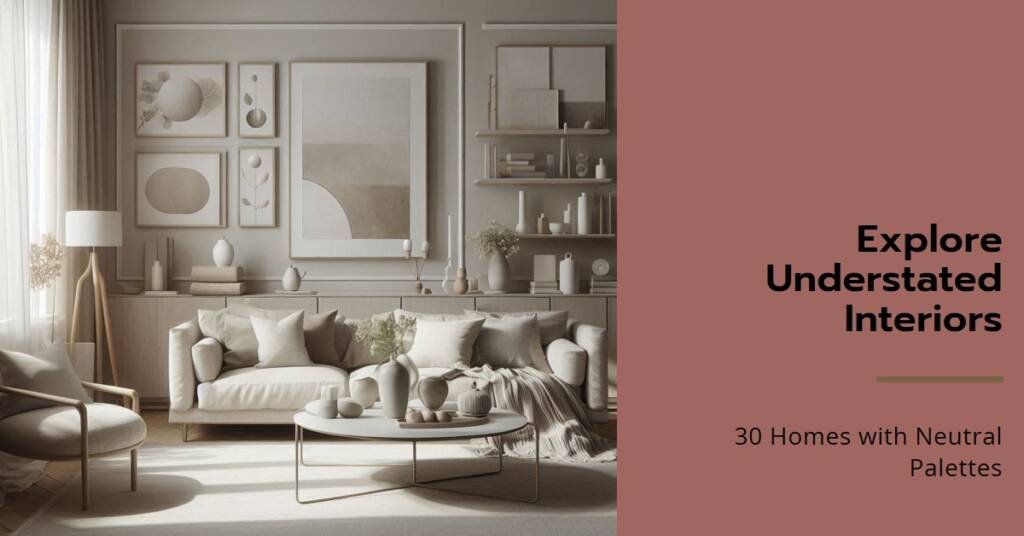
30 Stunning Homes Featuring Neutral Interiors
Neutral interiors have gained immense popularity in contemporary design, offering a calm and sophisticated atmosphere that appeals to a wide audience. Below, we present 30 stunning homes that beautifully exemplify the art of using neutral palettes, each showcasing unique architectural styles and personal touches that enhance the overall aesthetic.
The first home features a minimalist Scandinavian design, where white walls complement warm wooden accents. The understated decor, characterized by simple furniture and elegant textiles, creates an inviting environment that feels both modern and timeless. In another residence, an industrial style showcases exposed brick and concrete elements paired with soft beige furnishings, emphasizing the juxtaposition of raw and refined.
Next, we explore a charming cottage that employs a warm neutral palette to foster a cozy ambiance. Soft creams and muted greys envelop the space, accented by rustic wooden beams and delicate floral decor. Another remarkable example is a contemporary abode that uses large windows to allow natural light to bathe the interior in a soft glow, enhancing the neutral color scheme of taupes and whites.
Throughout this collection, we also see homes adorned with art collections that pop against the serene backgrounds, providing character while maintaining the understated theme. A mid-century modern home employs vibrant abstract paintings that gracefully meld with its neutral setting, accentuating each open space. Meanwhile, a coastal retreat features airy, light-hued furnishings and sandy tones, perfectly blending with its seaside surroundings.
Moreover, some homes highlight the use of texture to create visual interest without straying from the neutral theme. Textured wall coverings, layered rugs, and plush throws contribute to a sense of depth and sophistication. Each featured home represents a mastery of neutral interiors, emphasizing that these palettes can indeed reflect individuality and a unique design narrative.
Common Mistakes to Avoid in Neutral Interiors
When it comes to designing interiors with neutral palettes, many individuals inadvertently fall into certain traps that can detract from the overall aesthetic. One of the most frequently encountered mistakes is creating a space that feels overly sterile or bland. This often occurs when the selection of neutral colors lacks depth or variety, leading to a monotonous appearance. Instead of solely relying on whites, grays, or beiges, integrating different shades and textures can bring warmth and dimension to the space.
Another common pitfall is neglecting the importance of layering materials. A neutral color scheme can easily become flat if there is insufficient contrast and interaction between surfaces. To prevent this, it is advisable to incorporate various materials—such as wood, metal, and textiles—that provide visual interest and tactile appeal. For instance, combining a soft linen sofa with a rustic wooden coffee table introduces a dynamic element, transforming a simple neutral space into a sophisticated environment.
Additionally, one must also be cautious of underutilizing accessories and decor. Decorative elements such as artwork, cushions, and rugs play a crucial role in enlivening neutral interiors. A well-placed piece of bold artwork or a vibrant throw can create a focal point and break the monotony. However, it is important to strike a balance; accessories should complement the neutral theme rather than overwhelm it.
Moreover, proper lighting remains essential when working with neutral colors. Insufficient lighting can lead to an uninviting atmosphere. Employing a mix of ambient, task, and accent lighting can enhance both functionality and mood. Ultimately, by understanding these common mistakes and making conscious design choices, one can successfully curate a neutral interior that feels both inviting and harmonious.


Conclusion: Embracing Understated Interiors
Understated interiors featuring neutral palettes offer a remarkable way to create stylish yet functional living spaces. Throughout this exploration of 30 homes, we have observed how neutral color schemes serve as a foundation for various design elements, allowing for versatility while still providing an elegant atmosphere. These interiors facilitate a sense of calm and harmony, emphasizing simplicity over ostentation. By utilizing soft hues such as whites, grays, and beige, homeowners can achieve an inviting ambiance that truly reflects personal taste.
Moreover, the beauty of understated design lies in its adaptability. Whether you prefer a minimalist approach or wish to incorporate subtle decorative accents, neutral palettes provide the ideal backdrop for such creativity. This balance allows for personalized touches without overwhelming the overall aesthetic. Accessories in varying textures, strategic lighting choices, and carefully curated artwork can all play a role in enhancing the understated elegance of a neutral interior.
In the context of evolving design trends, embracing understated interiors enables individuals to cultivate spaces that are not only visually pleasing but also practical. These designs often promote an uncluttered lifestyle, encouraging mindfulness and offering a respite from the chaos of daily life. As we have seen in the showcased homes, achieving a delightful equilibrium between style and functionality is readily attainable with the right choices.
As you consider reimagining your own space, reflect on the principles and ideas presented in this compilation. By incorporating a neutral palette and embracing the philosophy of understated design, you can create environments that resonate with your unique personality while fostering connection and comfort. In a world that often leans towards excessive decor, choosing a more understated approach can be a refreshing change, allowing for a truly timeless aesthetic.