Table of Contents
- Introduction to Kahlo Blue
- The Origins of Kahlo Blue
- The Psychological Effects of Blue
- Kahlo Blue in Architectural Design
- Mixing Kahlo Blue: A Guide for Designers
- Sustainability and Eco-Friendliness in Color Choices
- Cultural Implications and Symbolism
- The Future of Kahlo Blue in Architecture
- Conclusion: The Lasting Impact of Kahlo Blue
Introduction to Kahlo Blue
Kahlo Blue is a distinctive hue that has become synonymous with vibrant expression and artistic depth, closely linked to the famed Mexican artist Frida Kahlo. This striking shade of blue often documented in her works reflects her emotions, identity, and cultural heritage. The historical significance of Kahlo Blue can be traced to its prevalence in traditional Mexican art, where color plays a critical role in conveying meaning and evoking feelings. Kahlo effectively used this bold color to create strong visual narratives, transforming her art into emotional landscapes that resonate with viewers.
Over the years, Kahlo Blue has transcended its origins primarily in the art world, making its entry into architecture and design. Architects and designers have embraced this vibrant color, utilizing it to create spaces that evoke a sense of warmth, joy, and connectivity. By employing Kahlo Blue in architectural projects, designers aim to establish a vibrant atmosphere that connects inhabitants to their cultural roots, reminiscent of Kahlo’s values and artistic motivations. This color acts not only as a visual statement but also as a catalyst for experience, inspiring emotion and engagement within architectural contexts.
The integration of Kahlo Blue within architectural design serves to enhance the overall aesthetic appeal and emotional resonance of physical spaces. It invites individuals to interact with their surroundings consciously, reflecting on the deeper meanings behind the color choice. As architecture seeks to create a bridge between the past and present, Kahlo Blue stands out as a testament to how color can influence our perception of a space, guiding feelings and encouraging creativity in both everyday and extraordinary environments.
The Origins of Kahlo Blue
Kahlo Blue, a color synonymous with both vibrancy and depth, has a rich history rooted in the natural world and the technological advancements of modern chemistry. The distinctive hue primarily derives from the use of indigo, a pigment that has been cherished since ancient times. Sourced from the leaves of the Indigofera plant, this organic dye has been integral to various cultures worldwide, from the deep blue textiles of West Africa to the traditional attire of Japan and India. Indigo’s significance transcends mere aesthetics; it has played a role in trade, economic systems, and social identity.
In addition to indigo, other pigments contribute to the unique brilliance of Kahlo Blue. One of these is the synthetic hue known as ultramarine, which has been utilized since the 19th century. Its creation involves the complex processing of natural lapis lazuli, and unlike indigo, it became accessible in larger quantities due to advancements in chemical processes. The process involves grinding the mineral into fine powder and chemically altering it to achieve varying shades of blue, including the vibrant tones found in Kahlo Blue. This shift from natural to synthetic sources reflected changes in artistic and architectural practices, expanding the scope of color use.
The cultural significance surrounding Kahlo Blue is undeniable. It has been infused with meanings of creativity, passion, and identity, often reflecting the heritage of the regions where it is predominantly used. This color not only serves as a visual delight but also embodies the fusion of tradition and modernity. From the vivid murals of Frida Kahlo’s abode to contemporary architectural innovations, Kahlo Blue remains a pivotal element that encapsulates both historical roots and current trends in color application.
The Psychological Effects of Blue
The color blue has long been associated with a variety of psychological and emotional effects, often linked to feelings of calmness and tranquility. Research in the field of color psychology indicates that blue is perceived as a soothing hue, evoking sensations akin to those felt when immersed in nature, such as observing a clear sky or the calmness of a serene lake. Kahlo Blue, in particular, embodies a richness and depth that can amplify these inherent qualities, making it especially appealing in architectural contexts.
One of the notable psychological effects of Kahlo Blue is its ability to foster a sense of serenity. When applied within architectural designs, this hue can create environments that promote relaxation and reduce stress. The peacefulness attributed to blue is beneficial in various settings, from private spaces such as homes to public venues like hospitals and educational institutions. By incorporating Kahlo Blue into the color palette, designers can facilitate an atmosphere conducive to both contemplation and inspiration.
Moreover, blue has been associated with creativity. Studies suggest that the color can enhance creative thinking and problem-solving abilities. As such, spaces adorned with Kahlo Blue could stimulate innovative ideas and foster an environment where creativity thrives. Within workplaces or artistic environments, this color choice could serve as a psychological catalyst, encouraging individuals to explore their artistic capacities and engage in profound cognitive processes.
In conclusion, the emotional and psychological effects of Kahlo Blue contribute significantly to its allure in architectural design. Its ability to cultivate tranquility and enhance creativity makes it a compelling choice for a wide range of environments. By understanding the effects of this enchanting color, architects and designers can employ it thoughtfully, enriching the experience of those who inhabit these spaces.
Kahlo Blue in Architectural Design
Kahlo Blue, a vibrant and captivating hue, has made a significant impact in the realm of architectural design. This distinctive color, often associated with bold artistic expression, finds its place in various structures, both residential and commercial. Its application is not merely aesthetic; it serves to embody the character and essence of designed spaces. When integrated thoughtfully, Kahlo Blue can enhance a building’s personality, harmonizing with its surroundings while also standing out as a statement of individuality.
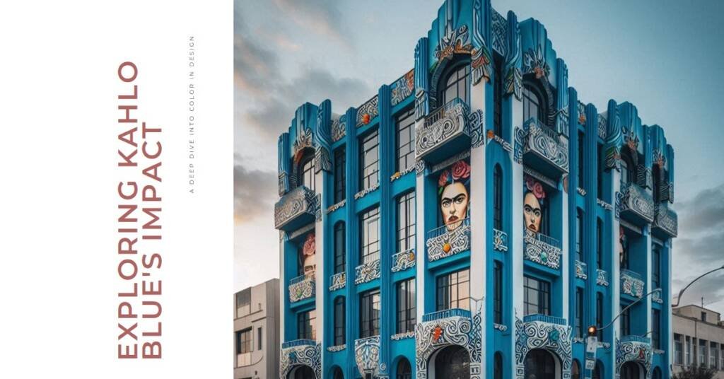
One notable example of Kahlo Blue in architectural design can be observed in the Casa Estudio Diego Rivera y Frida Kahlo, the former home of artist Frida Kahlo herself. The exterior of this historic residence is painted in a striking shade of blue, creating a visual dialogue with the lush greenery that envelops it. This choice not only reflects Kahlo’s vibrant personality but also anchors the home within its environment, making it a vivid landmark in Mexico City. The blue facade evokes emotional responses, drawing visitors and passersby alike, thus underscoring the building’s cultural significance.
Similarly, in commercial architecture, the use of Kahlo Blue can be seen in various urban structures that aim to project creativity and energy. For instance, a contemporary art gallery in San Francisco employs Kahlo Blue to attract attention and create an inviting atmosphere for art enthusiasts. The brilliant blue walls contrast sharply against the neutral tones of surrounding buildings, thereby invoking curiosity and making the gallery a focal point of the area. In this case, the color not only enhances the architectural design but also communicates the gallery’s commitment to contemporary art and innovation.
Through these examples, it is evident that Kahlo Blue is more than a mere color; it plays an integral role in defining the architectural narrative of a space, making it a powerful tool for architects and designers looking to create memorable, impactful structures.
Mixing Kahlo Blue: A Guide for Designers
Kahlo Blue, a vibrant shade reminiscent of the intense hues found in Frida Kahlo’s artwork, is a striking color choice for architects and designers seeking to make a statement in their projects. Effectively mixing and implementing this color requires careful consideration of complementary shades, materials, and lighting. This guide aims to assist designers in harnessing the full potential of Kahlo Blue in their work.
When incorporating Kahlo Blue, choosing the right color combinations is essential. This hue pairs beautifully with neutral tones such as whites, grays, and beiges, providing a visually appealing contrast that enhances its vibrancy. To create a more dynamic palette, consider integrating warm colors like terracotta or golden yellows, which can evoke a sense of warmth and depth. Additionally, contrasting colors such as deep greens or rich purples can form an engaging visual balance, ensuring Kahlo Blue remains the focal point without overwhelming the space.
Material selection plays a crucial role in achieving the desired effect of Kahlo Blue. Textiles, tiles, and paints can all reflect different aspects of the color, depending on their finish and texture. Matte finishes can soften the intensity of Kahlo Blue, making it suitable for more subdued environments, while glossy surfaces can amplify its brightness and serve as a striking focal point. Selecting materials that complement this blue is vital for coherence, so consider incorporating natural elements like wood or stone that can ground the vividness of the hue.
Lastly, lighting conditions significantly influence the perception of color. Natural light tends to bring out the vibrancy of Kahlo Blue, while artificial lighting can alter its appearance, making it more subdued or even transforming its tone. When planning a design, it is essential to test how Kahlo Blue interacts with various lighting sources at different times of the day to ensure it achieves the desired aesthetic outcome.
Sustainability and Eco-Friendliness in Color Choices
In contemporary architectural design, the selection of colors and materials extends beyond aesthetic appeal; it encompasses responsibility towards the environment. Kahlo Blue, a color associated with vibrancy and emotional resonance, can also forge a path toward sustainable practices in its production and application. The necessity for sustainable architecture highlights the significance of eco-friendly color choices, particularly in sourcing materials and pigments.
The traditional methods of pigment production often involve environmentally harmful processes. However, advancements in technology and an increased awareness of ecological impacts have led to the emergence of sustainable alternatives. Numerous companies are now dedicated to extracting pigments from natural sources, thus minimizing the reliance on synthetic dyes. This shift not only reduces pollution but also contributes to lowering the overall carbon footprint associated with building materials.
Additionally, the rise of plant-based and mineral pigments offers architects a palette that includes stunning shades of Kahlo Blue while maintaining ecological integrity. These options reflect the commitment to sustainability, ensuring that color choices do not detract from the environment. Eco-friendly alternatives like natural pigments derived from clay or various botanicals can provide the desired hue without compromising on quality or visual impact. By emphasizing these alternatives, architects can beautifully balance the aesthetics of Kahlo Blue with the principles of sustainability.
The role of color in architecture cannot be understated, as it can significantly influence a building’s identity and its integration within a natural setting. Sustainable practices in color selection promote not only aesthetic value but also underscore a profound respect for nature. By conscious decision-making in sourcing pigments, designers can adopt an eco-friendly approach that inspires future generations to appreciate and advocate for a harmonious relationship between architecture and the environment.
Cultural Implications and Symbolism
Kahlo Blue, a vibrant hue that draws inspiration from the iconic Mexican artist Frida Kahlo, is imbued with rich cultural significance. Across various cultures, the color blue has been interpreted through diverse lenses, often embodying a complex spectrum of meanings. One of the most prevalent associations with the color blue is its connection to peace. This symbolism can be traced back to ancient civilizations that viewed blue as calming and tranquil, often relating it to the sky and water, which are vital for sustaining life.
In the context of architectural design, Kahlo Blue serves as a vehicle for cultural expression, often evoking feelings of serenity and stability. The use of blue in buildings, particularly in regions influenced by Mexican culture, communicates a sense of harmony and tranquility. Furthermore, its embodiment of loyalty and trust can be particularly compelling in communal and public spaces where these values are paramount. When incorporated into architectural statements, Kahlo Blue reinforces the notion of commitment to community, enhancing the overall narrative of social harmony.
The color blue also holds spiritual connotations in many cultures, often associated with introspection and reflection. This depth of meaning invites emotions and engages viewers on multiple levels, thereby enriching the architectural landscape. When used effectively, Kahlo Blue has the potential to create profound connections between the structure and its inhabitants, translating into an architectural dialogue that resonates with themes of belonging and identity. Through its powerful visual impact and cultural resonance, Kahlo Blue challenges architects and designers to explore the broader implications of color, ultimately inviting deeper engagement with space and context.
The Future of Kahlo Blue in Architecture
Kahlo Blue, a vibrant hue inspired by the works of Mexican artist Frida Kahlo, is poised to play a significant role in the future of architectural design. As we move towards an increasingly interconnected world, the importance of color in architecture becomes ever more pronounced. This shade, reminiscent of lush landscapes and striking cultural motifs, stands to be a pivotal element in the evolution of modern architecture. It is likely that Kahlo Blue will be embraced not just for its aesthetic appeal but also for the emotional resonance it can evoke.
As color theory continues to develop, architects and designers are expected to explore the psychological impacts of colors like Kahlo Blue. With research supporting the idea that colors influence mood and perception, architects may integrate shades like this to enhance the well-being of inhabitants. Future trends could see Kahlo Blue utilized in both commercial and residential spaces to create environments that foster creativity, tranquility, and cultural appreciation.
Additionally, emerging architectural movements, especially those prioritizing sustainability and biophilic design, might adopt Kahlo Blue as a cornerstone color. This movement often aims to harmonize built environments with nature, and the calming qualities of Kahlo Blue can serve to bridge the two. As materials and methods evolve, the application of this shade could expand beyond paint, finding its way into tiles, fabrics, and even lighting design, making it a versatile option for creating immersive spaces.
In essence, the future of Kahlo Blue in architecture is promising, driven by a combination of aesthetic innovation, psychological insight, and a commitment to sustainable practices. As architects experiment with this captivating hue, it is likely to foster an environment that resonates with both beauty and cultural significance.

Conclusion: The Lasting Impact of Kahlo Blue
Kahlo Blue, with its rich history and vibrant hue, represents more than just a color; it serves as an architectural statement that transcends time. As explored throughout this blog post, the significance of Kahlo Blue lies in its ability to evoke emotion, create atmosphere, and enhance the aesthetic quality of spaces. This unique shade draws inspiration from Frida Kahlo, reflecting her passionate spirit and artistic vision, and it is this confluence of color and meaning that makes it so impactful in the realm of design.
Architectural designs infused with Kahlo Blue not only pay homage to Kahlo’s artistic legacy but also demonstrate the power of color to shape human experience. The use of this distinctive hue in various structures has the ability to transform conventional spaces into vibrant works of art, captivating the imagination and fostering a deeper connection between occupants and their environment. In many ways, Kahlo Blue embodies the essence of creativity and innovation, making it an ideal choice for modern architects seeking to challenge conventional norms.
As we look to the future, the influence of Kahlo Blue is likely to persist in architectural practices. Its potential to inspire will remain as designers continue to explore new avenues of expression through color. The ongoing dialogue about the psychological and emotional facets of color in architecture reinforces the notion that color is not merely aesthetic; it is a powerful tool that can enhance our lived experiences. Therefore, Kahlo Blue will undoubtedly remain a significant reference point for architects and designers seeking to create environments that resonate on both a visual and emotional level.