Table of Contents
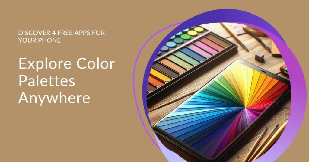
- Introduction to Color Palettes
- Why Use Smartphone Apps for Color Palettes?
- ColorSnap by Sherwin-Williams
- App #2: Adobe Capture
- App #3: Color Palettes by Aesthetic
- App #4: Palette Cam
- Comparative Analysis of the Apps
- Tips for Creating Effective Color Palettes
- Conclusion: Enhancing Your Creativity on the Go
Introduction to Color Palettes
Color palettes are essential tools in the fields of design and art, playing a critical role in shaping visual aesthetics and conveying emotions. A color palette is essentially a curated selection of colors that work harmoniously together, allowing artists, designers, and everyday users to create visually appealing and cohesive compositions. The significance of color palettes extends far beyond mere aesthetics; they serve as powerful communicative tools that can evoke specific feelings, draw attention, and influence decision-making processes.
In various domains, such as graphic design, web development, and interior decorating, the choice of color can greatly affect the user experience. For instance, in graphic design, a well-chosen color palette can enhance branding and create an emotional connection with the audience. Likewise, in web development, the strategic use of color palettes can improve user engagement and navigation, leading to increased conversions. In interior decorating, different color combinations can transform the ambiance of a space, making it feel either calming or energizing. This versatility highlights how color palettes are integral to both practical and expressive applications across multiple disciplines.
The psychological impact of color also cannot be underestimated. Colors can evoke a range of emotions and associations; for example, warm tones like red and orange may stimulate excitement or enthusiasm, while cooler hues like blue and green can foster tranquility and calmness. Understanding the emotional response that color can elicit is crucial for anyone looking to utilize color palettes effectively in their projects. As such, having access to tools and resources that facilitate the selection and creation of color palettes is increasingly necessary. This is why many smartphone applications have emerged, offering users the ability to curate their own color schemes conveniently and efficiently, ensuring that anyone can harness the power of color in their endeavors.
Why Use Smartphone Apps for Color Palettes?
The advancement of technology has transformed how we interact with color, making smartphone applications an increasingly popular choice for creating and managing color palettes. Unlike traditional methods, which often rely on physical color swatches or cumbersome desktop software, these apps offer an unprecedented level of convenience and accessibility. Users can craft and store their color palettes on-the-go, allowing for a seamless creative workflow that fits into busy lifestyles.
Smartphone apps streamline the process of color selection and application, enabling users to capture inspiration directly from their environment. Whether it is a striking sunset, a vibrant street mural, or a beautifully arranged bouquet, these applications allow individuals to take photos and extract colors from them instantly. This functionality not only enhances creativity but also fosters a deeper understanding of color relationships, making it easier to implement color theory principles in various projects.
Furthermore, the portability of smartphones democratizes the experience of engaging with color theory and application. Unlike in the past, when access to professional-grade tools was largely reserved for designers and artists, today’s smartphone users encompass a wide range of individuals. This includes hobbyists, students, and even professionals seeking a quick and efficient method for color exploration. As a result, anyone can engage with color palettes without requiring extensive prior knowledge or formal training.
In addition, many color palette apps feature built-in sharing options, facilitating collaboration and feedback amongst peers. This social aspect of color selection not only enriches the user experience but also serves as a platform for learning. Users can exchange ideas, gain insights into color preferences, and discover trends that enhance their design projects.
ColorSnap by Sherwin-Williams
ColorSnap by Sherwin-Williams is a highly regarded mobile application designed for color enthusiasts and homeowners seeking to enhance their spaces. One of its standout features is the color capture function, which allows users to take a photo of any object or landscape and extract the dominant colors, seamlessly translating real-world hues into digitized color options. This unique capability makes it an indispensable tool for anyone looking to match colors accurately.
In addition to this innovative technology, ColorSnap offers a diverse range of pre-defined color palettes curated by experts at Sherwin-Williams. These palettes can serve as excellent inspiration for users contemplating a refresh in their home decor. The app’s intuitive interface facilitates easy navigation while browsing through various shades, helping to streamline the decision-making process when selecting the perfect color for any room.
Moreover, ColorSnap’s visualization feature allows users to see how selected colors will appear in different settings before making a commitment. By virtually painting a room, users can evaluate how various colors interact with lighting and other decor elements, ultimately aiding in making informed choices. This functionality has proven particularly helpful for first-time DIYers who may feel overwhelmed by the plethora of available options.
Feedback from users underscores the app’s effectiveness. Many have praised its user-friendly design and functional capabilities, which provide a seamless experience in color matching and selection. Testimonials highlight not only the accuracy of the color recognition but also how it has simplified the painting process for many, resulting in satisfied transformations of their living spaces. Overall, ColorSnap by Sherwin-Williams is a reliable companion for those seeking to infuse color into their environments effectively.
App #2: Adobe Capture
Adobe Capture is a multifunctional smartphone app that stands out in the realm of design tools, extending well beyond just creating color palettes. This innovative application is designed to empower creatives by providing a comprehensive suite of tools that facilitate artistic expression through color extraction, pattern creation, and vector graphics generation.
One of the notable features of Adobe Capture is its ability to extract colors from images. Users can simply point their camera at a scene or select an image from their gallery, and the app will automatically generate a curated color palette based on the extracted hues. This functionality is particularly beneficial for designers seeking inspiration from their surroundings or looking to create harmonious color schemes for their projects. With just a few taps, an array of color combinations can be curated, making the design process more efficient and visually appealing.
Beyond color extraction, Adobe Capture allows users to create seamless patterns. This feature enables designers to transform their chosen colors and images into intricate designs that can be utilized across various projects, from fashion to interior design. Moreover, the capability to generate vector graphics directly from photographs or sketches simplifies the creative process, as users can convert their visual elements into scalable formats suitable for digital or print media.
Furthermore, Adobe Capture seamlessly integrates with other Adobe products, such as Illustrator and Photoshop. This integration enhances workflow by allowing users to sync their palettes, patterns, and assets across multiple platforms, enabling a cohesive design experience. Such connectivity makes Adobe Capture an indispensable tool for designers who require consistent access to their creative resources while on the move.
App #3: Color Palettes by Aesthetic
Color Palettes by Aesthetic is an innovative mobile application that caters to users with a refined taste for color combinations. Designed with simplicity in mind, the app features an intuitive user interface, allowing individuals—regardless of their design background—to navigate the platform easily. The layout is clean and visually appealing, which enhances the overall user experience. This makes it particularly attractive for anyone interested in exploring curated color combinations, whether for digital design, interior decoration, or fashion.
One of the key elements of Color Palettes by Aesthetic is the inspiration it provides through trending palettes. Users can browse an extensive collection of color schemes that resonate with current aesthetics, which is beneficial for anyone seeking fresh ideas. The trending section is updated regularly, ensuring that users have access to the latest color trends and innovations in design. This continuous flow of new palettes keeps creativity alive and encourages users to experiment and adapt these palettes to their personal projects.
Moreover, the app fosters a strong community aspect, allowing users to share their creations with others. Users can upload their own palettes, displaying their unique takes on color combinations, which contributes to a vibrant ecosystem of shared design ideas. The incorporation of user-generated content not only adds depth to the app’s resources but also cultivates a sense of belonging among users. Through collaborative sharing, individuals can appreciate diverse interpretations of color and draw inspiration from their peers. Overall, Color Palettes by Aesthetic stands out as a go-to tool for those looking to explore the art of color curation while engaging with a like-minded community.
App #4: Palette Cam
Palette Cam is an innovative smartphone application designed to help users create unique color palettes directly from their photographs. This app effectively recognizes and extracts dominant colors from images, allowing users to generate color palettes effortlessly. Its user-friendly interface makes it accessible for both seasoned professionals and beginners, enhancing the overall user experience.
One of the standout features of Palette Cam is its ability to customize and modify generated palettes. Users can edit colors, adjust saturation, and experiment with different shades, providing an unparalleled level of flexibility in creating a personalized color scheme. This functionality is particularly appealing to photographers and graphic designers who seek to match their visual content with specific themes or aesthetics.
In addition to its palette generation capabilities, Palette Cam includes an easy export function that allows users to save and share their color palettes seamlessly. Whether one wishes to use the palettes for digital design projects, art creation, or social media content, the app makes sharing colors across platforms an effortless endeavor. Users can quickly export palettes to popular design software or share them via email and social media, fostering collaboration among peers.
The versatility of Palette Cam benefits a wide array of users, including artists who draw inspiration from their everyday surroundings, hobbyists exploring new color combinations, and photographers striving to maintain a cohesive visual style. By making color accessibility a priority, Palette Cam empowers users to harness the beauty of their environment creatively. Ultimately, this app not only enhances the artistic process but also invites creativity wherever inspiration may strike.
Comparative Analysis of the Apps
When selecting a color palette app, the user experience and interface can greatly influence the overall effectiveness and enjoyment of the application. Each of the four smartphone apps presents unique strengths and weaknesses in this regard. For instance, App A is recognized for its intuitive interface and minimalistic design, making it accessible to beginners or casual users who prefer straightforward navigation. In contrast, App B boasts a more complex layout, catering to advanced designers seeking extensive customization options and deeper color analysis. Its richer features may overwhelm users who desire simplicity.
Features differentiate these applications significantly. App C excels in offering a vast library of pre-designed palettes and allows users to create their own palettes from images, which is particularly beneficial for creative professionals who require inspiration on-the-go. Meanwhile, App D focuses on community engagement, enabling users to share their own palettes and explore creations from others. This social aspect can enhance the creative process, particularly for those who thrive on collaboration and feedback. However, this feature might be less appealing to users who prioritize individual work.
Moreover, the suitability of each application varies based on the user’s intended purpose. For professionals such as graphic designers or interior decorators, the advanced capabilities of App B may serve them well, while the simplicity of App A may better suit educators or casual hobbyists. App C serves a dual purpose, appealing to both novices and experts, while App D’s community-based model encourages interaction among users of all skill levels.
Ultimately, the choice of app should reflect individual preferences regarding user interface, desired features, and engagement level with the community. Users must evaluate their personal or professional needs to determine the most appropriate app for their color palette requirements.
Tips for Creating Effective Color Palettes
Creating effective color palettes is essential for any design project, as it significantly impacts the visual appeal and emotional response to the work. A foundational understanding of color theory is crucial; this involves knowing the color wheel, primary, secondary, and tertiary colors. The concepts of complementary, analogous, and triadic color schemes can guide the selection of colors that work harmoniously together. For example, complementary colors—those positioned opposite each other on the wheel—tend to create vibrant contrasts that can capture attention. Thus, utilizing these principles effectively will lay a strong groundwork for constructing visually appealing palettes.
Contrast plays an equally vital role in the development of color palettes. Although a set of colors may appear aesthetically pleasing, it is important to ensure that they stand out adequately against one another. This can be achieved by varying the brightness, saturation, and hue of the colors. For instance, when designing a user interface, employing darker shades against lighter elements can facilitate readability and guide the viewer’s focus. Apps designed for color selection can serve as invaluable tools in this context. Many of the free smartphone applications mentioned earlier offer features such as contrast checkers, which can help assess the strength of a color combination.
Furthermore, brainstorming and seeking inspiration from various sources can ignite creativity, which is essential for developing unique color palettes. Observing nature, art, and fashion allows designers to appreciate color in different contexts and can inspire new combinations. Engaging with these external sources can foster innovative thinking and lead to the discovery of unexpected yet effective color pairings. Ultimately, by integrating knowledge of color theory, focusing on contrast, and drawing inspiration from various elements, one can create compelling and effective color palettes for any design endeavor.


Conclusion: Enhancing Your Creativity on the Go
In today’s fast-paced world, the use of smartphone applications for managing color palettes offers numerous benefits for individuals in creative fields. These free tools not only simplify the process of selecting and organizing colors but also inspire creativity in various projects, from graphic design to interior decorating. The accessibility of these applications means that anyone can explore color combinations and develop their unique styles without the need for expensive software or extensive training.
Moreover, the convenience of having these resources at your fingertips allows for spontaneous creativity. Whether you are a seasoned designer or a novice exploring your artistic side, the smartphone apps highlighted in this blog post can significantly enhance your workflow. They provide instant access to a variety of color palettes, making it easy to experiment with different tones, shades, and contrasts that can elevate your projects. The ability to capture and save inspiration directly from your environment encourages a more explorative design process, leading to innovative outcomes.
We encourage readers to try out the mentioned applications and delve into their own preferences regarding color. By experimenting with different palettes, you can cultivate a deeper understanding of color theory and its influence on design. Enhancing your creativity on the go becomes not just achievable, but an enjoyable experience as you immerse yourself in the vibrant world of color. Ultimately, these mobile tools can transform your approach to creativity, encouraging an ongoing exploration of aesthetics that enriches both your professional projects and personal expressions.