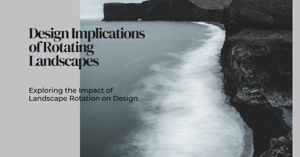
Table of Contents
- Introduction: Redefining Perspectives in Design
- Historical Context: Evolution of Landscape Orientation
- The Case for Rotation: Beyond the Traditional Boundaries
- Visual Hierarchy and User Experience: Rethinking Priorities
- Impact on Content: Adapting to Vertical Constraints
- Navigation and Interaction: Enhancing Usability
- Responsive Design: Fluidity Across Orientations
- Accessibility Considerations: Inclusive Design Practices
- Case Studies: Successful Rotations in Practice
- Conclusion: Embracing a New Design Paradigm
Introduction: Redefining Perspectives in Design
The landscape orientation has traditionally dominated design, from the sprawling vistas of Renaissance art to the expansive layouts of modern digital interfaces. However, what happens when this familiar orientation is rotated? This seemingly simple shift can have profound implications for design, usability, and user experience. In this blog post, we will delve into the nuanced world of rotated landscapes, exploring how this alteration impacts various aspects of design and why it deserves serious consideration from modern designers.
Historical Context: Evolution of Landscape Orientation
Landscape orientation has a rich history rooted in both art and technology. Historically, landscape paintings were crafted to capture the breadth of natural scenes, allowing viewers to immerse themselves in wide, expansive views. This orientation naturally translated into other visual mediums, including photography and eventually digital displays.
In the digital realm, landscape orientation became the standard for monitors, television screens, and web design. The wider aspect ratio accommodated more content and facilitated multitasking, becoming a staple in both professional and personal settings. However, as devices and user behaviors evolve, so too must our approach to design.
The Case for Rotation: Beyond the Traditional Boundaries
Rotating a landscape-oriented design to portrait can initially seem counterintuitive. Yet, this rotation is not merely about changing the aspect ratio; it challenges designers to rethink their layout, hierarchy, and user interaction. By breaking away from traditional boundaries, designers can unlock new creative possibilities and address specific user needs more effectively.
For instance, mobile devices are naturally held in portrait mode, making this orientation more intuitive for mobile app design. Furthermore, rotating the layout can emphasize different elements, guiding users through a more linear, focused experience. This shift requires careful consideration of content placement, readability, and overall aesthetic balance.
Visual Hierarchy and User Experience: Rethinking Priorities
When a landscape layout is rotated, the visual hierarchy must be reassessed. In landscape orientation, the eye typically scans from left to right, distributing attention across a wider field. In contrast, portrait orientation guides the eye from top to bottom, necessitating a reevaluation of which elements should be prioritized.
Designers must strategically place key information at the top of the layout, ensuring it captures the user’s attention immediately. This top-to-bottom flow can enhance readability and engagement, especially on smaller screens. Additionally, vertical layouts can simplify navigation, making it easier for users to scroll through content and find what they need quickly.
Impact on Content: Adapting to Vertical Constraints
Rotating a landscape layout to portrait orientation imposes new constraints on content. Text-heavy designs must be restructured to fit the narrower width, often resulting in longer, more scrollable pages. This necessitates concise, impactful writing and strategic use of whitespace to avoid overwhelming the user.
Images and multimedia elements also need to be reconsidered. Wide images may need to be cropped or resized, while videos might require adjustments to ensure optimal viewing in portrait mode. Designers must strike a balance between maintaining visual appeal and ensuring that content remains accessible and engaging.
Navigation and Interaction: Enhancing Usability
Navigation patterns change significantly when a landscape design is rotated. Horizontal menus, common in landscape layouts, may not translate well to portrait orientation. Instead, vertical menus or hamburger menus can provide a more intuitive navigation experience on narrower screens.
Interactive elements, such as buttons and forms, must also be resized and repositioned to ensure they remain easily tappable. This is particularly crucial for mobile devices, where users interact with touchscreens. By optimizing these elements for portrait orientation, designers can enhance usability and create a more seamless user experience.

Responsive Design: Fluidity Across Orientations
Responsive design principles become even more critical when considering rotated landscapes. A truly responsive design must fluidly adapt to both landscape and portrait orientations, providing a consistent experience regardless of how the device is held.
This adaptability requires flexible grid systems, scalable images, and typography that adjusts dynamically. Designers must test their layouts across multiple devices and orientations to ensure that all elements remain functional and visually appealing. By embracing a responsive approach, designers can create versatile designs that cater to diverse user preferences and behaviors.
Accessibility Considerations: Inclusive Design Practices
Accessibility should always be at the forefront of design considerations, and this holds true when rotating landscape layouts. Portrait orientation can present unique challenges for users with visual or motor impairments, necessitating thoughtful design choices to ensure inclusivity.
For instance, larger text sizes and ample spacing can improve readability, while clearly defined touch targets can aid users with motor difficulties. Additionally, designers should ensure that their layouts are compatible with screen readers and other assistive technologies, providing an inclusive experience for all users.
Case Studies: Successful Rotations in Practice
Several successful case studies highlight the potential of rotated landscape designs. One notable example is the redesign of digital magazines, which have shifted from traditional landscape spreads to portrait layouts optimized for mobile reading. This transition has enhanced readability, user engagement, and accessibility, showcasing the benefits of rethinking orientation.
Another example is in web design, where vertical scrolling sites have gained popularity. These sites guide users through a linear narrative, leveraging the portrait orientation to create immersive, storytelling experiences. By studying these and other successful implementations, designers can draw valuable insights into the practical applications of rotated landscapes.
Conclusion: Embracing a New Design Paradigm
Rotating a landscape layout challenges designers to think beyond conventional constraints and explore new possibilities. This shift can enhance user experience, improve accessibility, and open up fresh creative avenues. By thoughtfully considering the implications of this rotation, designers can create innovative, user-centric designs that resonate in an increasingly mobile and diverse digital landscape.
In conclusion, the rotation of landscape-oriented designs to portrait orientation is not merely a technical adjustment; it represents a paradigm shift in how we approach visual communication. As devices and user behaviors continue to evolve, so too must our design practices. Embracing this new perspective can lead to more engaging, accessible, and innovative designs, ultimately enriching the user experience in profound ways.