Table of Contents
- Introduction to Neutral Colors
- The Benefits of Using Neutral Colors
- Exploring Different Neutral Shades
- Combining Neutrals with Other Colors
- 30 Homes Showcasing Neutral Palettes
- Design Tips for Incorporating Neutrals
- Common Mistakes to Avoid with Neutral Colors
- The Future of Neutral Colors in Interior Design
- Conclusion
Introduction to Neutral Colors
Neutral colors refer to a range of hues that typically do not appear on the color wheel, including shades of white, gray, beige, taupe, and elements of cream, charcoal, and brown. In interior design, these colors serve as a foundation, providing a versatile backdrop that complements a wide variety of styles and decor elements. Their understated nature can evoke a sense of calm and sophistication, making them an exceptional choice for both residential and commercial spaces.
The psychological effects of neutral tones extend beyond mere aesthetics. Soft, muted colors are often associated with tranquility and comfort, making them ideal for areas designed for relaxation, such as bedrooms and living rooms. When used thoughtfully, neutral palettes can create an inviting atmosphere, enhancing well-being and fostering a sense of peace. Furthermore, these shades promote focus and clarity, making them popular in workspaces where concentration is essential.
One of the greatest advantages of neutral colors is their remarkable versatility. They can seamlessly adapt to various design themes, from modern minimalism to cozy rustic interiors. Neutral palettes allow homeowners and designers to experiment with different textures, materials, and accent colors without overwhelming a space. For instance, pairing a warm beige with natural wood elements can create a cozy ambiance, while a cooler gray backdrop might lend itself to a more contemporary, streamlined look.
In essence, incorporating neutral colors into interior design enables the creation of environments that are both stylish and serene. As we explore different homes showcasing these understated palettes, the profound impact of neutral tones on the overall aesthetic and emotional experience will become evident. Through various examples, we will illustrate how effective the strategic use of neutral shades can be in crafting balanced, beautiful spaces.
The Benefits of Using Neutral Colors
Incorporating neutral colors into home interiors presents a myriad of advantages that can significantly enhance the overall aesthetic and functionality of a space. Foremost, neutral colors have the unique ability to create an open and spacious feel in any environment. By opting for a neutral palette, homeowners can effectively reflect light, thereby amplifying the natural brightness of a room. This optical illusion not only makes spaces appear larger but also creates a welcoming atmosphere.
Additionally, neutral colors promote a sense of tranquility and serenity, essential for fostering a comfortable living environment. These subtle hues, ranging from soft whites to warm beiges and greys, offer a calming effect that can reduce stress levels. This is particularly beneficial in spaces dedicated to relaxation, such as bedrooms and living rooms. The soothing presence of neutrals encourages occupants to unwind, contributing positively to their mental well-being.
Another significant benefit of utilizing neutral colors lies in their versatility. They serve as an ideal backdrop for decorative elements, allowing homeowners to incorporate vibrant furnishings, artwork, and accessories without clashing. This adaptability enables easy updates with changing trends or personal tastes, facilitating a living space that always feels fresh and inviting. Furthermore, neutral tones have a timeless appeal, ensuring that a home will not fall out of style as design fads evolve.
Finally, neutral colors can harmonize with various design styles, from traditional to contemporary. As such, they can effectively unify disparate elements in a room, creating a cohesive look that reflects the homeowner’s personality. Neutral hues are not only a practical choice but also a wise investment in the enduring elegance of a space. Their multitude of benefits underscores why they remain a popular choice among interior designers and homeowners alike.
Exploring Different Neutral Shades
Neutral shades play a vital role in interior design, providing a serene backdrop that enhances the aesthetics of a space. Among these, whites, beiges, greys, and taupes are the primary contenders, each offering a unique influence on the ambience and emotional resonance of a room. Understanding the subtleties of these shades is essential for achieving a harmonious interior.
White is often perceived as a clean, crisp color that evokes feelings of openness and tranquility. It can make smaller spaces appear larger and more inviting. However, the choice of white can vary significantly; cool whites may have blue undertones, while warm whites might lean towards yellow or cream. This variability can affect how light interacts with the space, so it is crucial to consider the lighting conditions when selecting a white tone.
Beiges come in a spectrum that blends warm and cool undertones, offering versatility in design. Warm beige can emit a cozy, welcoming feel, making it ideal for living areas or bedrooms. Conversely, cooler beiges can serve as a subtle backdrop in modern, minimalist spaces. When paired with rich textures or decorative elements, beige can create a sophisticated yet understated aesthetic.
Greys have surged in popularity due to their contemporary appeal and ability to complement nearly any style. The vast range of greys, from soft pastels to deep charcoal, provides options to evoke either calmness or drama. It is essential to test different shades against existing furnishings and natural light to find the perfect grey that enhances the overall mood of the room.
Taupes combine the qualities of both brown and grey, often creating a warm and inviting environment. This shade is especially effective in transitional spaces, bridging rustic and modern elements seamlessly. Selecting the correct taupe can add depth without overwhelming the senses, making it an excellent choice for various settings.
When choosing neutrals, consider the surrounding decor and how natural and artificial light will play on the colors throughout different times of the day. Collaboration between shade, texture, and the overall composition of the room yields a balanced atmosphere that embodies the principles of great design.
Combining Neutrals with Other Colors
Neutral colors play a fundamental role in interior design, serving as a versatile backdrop that allows for creativity and individuality to flourish. When combined thoughtfully with bolder colors, these understated palettes can create spaces that are visually appealing yet remain serene. The key to effectively integrating neutral tones with vibrant hues lies in understanding balance and contrast.
One effective approach to blending neutral colors with brighter accents is through the use of strategic placement. For instance, a neutral sofa can be adorned with colorful cushions or throws that inject vitality into the space. This technique not only draws the eye but also maintains an overall sense of harmony. When selecting accent colors, it is advisable to choose two or three complementary shades that resonate with the neutral base, ensuring that they complement rather than clash with one another.
Furthermore, incorporating patterns is a great way to enliven neutral spaces. Textiles such as rugs, curtains, and upholstery can introduce varied textures and colors, enriching the overall aesthetic without overwhelming the senses. For example, a patterned rug that incorporates both neutral tones and splashes of color can serve as a focal point, linking different elements of the room together. It is essential, however, to maintain a balance by choosing patterns that are not overly busy, as this can detract from the tranquil quality that neutrals provide.
Artwork also plays a crucial role in combining neutral palettes with bolder colors. Select pieces that feature vibrant colors as a means of adding visual interest. When hung against a neutral wall, such artwork can become a sophisticated centerpiece without dominating the room’s ambiance. In sum, neutral colors form a solid foundation for fostering a cohesive design, especially when thoughtfully accented with brighter colors and textures. This deliberate approach enables the creation of inviting spaces that are both lively and tranquil.
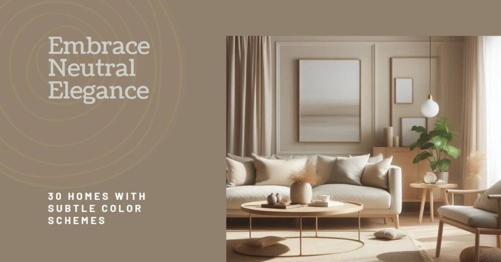
30 Homes Showcasing Neutral Palettes
Neutral color palettes have increasingly gained popularity in interior design, providing a soothing backdrop that promotes serenity and elegance. In this section, we explore 30 remarkable homes that exemplify the beauty and versatility of neutral schemes. Each selected residence stands out for its unique approach to using understated colors, demonstrating the profound impact this choice can have on the overall atmosphere.
The first home on our list features a minimalist design where shades of beige intertwine with white elements, promoting an airy, open feel. This strategic use of neutrals creates a sophisticated yet welcoming environment. Another standout is a coastal-inspired residence, where soft taupes and light grays dominate, reflecting the colors of the beach and sky, thus enhancing the tranquility of ocean views.
A contemporary urban loft utilizes varying hues of gray, accented with black and white to create a chic and modern vibe. The seamless integration of neutral tones allows for striking visual contrasts while maintaining a cohesive style. In contrast, a rustic farmhouse embraces warm earth tones, such as soft creams and light browns, which evoke warmth and comfort, showcasing how neutrals can enhance traditional designs.
Moreover, a mid-century modern home highlights the effective use of greige—an elegant blend of gray and beige—that connects various spaces through an understated sophistication. Each of these homes demonstrates that neutral palettes do not equate to monotony; rather, they allow texture, light, and form to take center stage. By highlighting unique features like architectural details, natural light, and furnishings, these designs illustrate the potential for neutral colors to create a balanced and harmonious atmosphere.
As we examine these diverse homes, it becomes evident that implementing a neutral color palette can provide substantial inspiration for anyone seeking to enhance their interior spaces. The artistry showcased through these designs reaffirms that with creativity, neutrals can transform any home into a serene sanctuary.
Design Tips for Incorporating Neutrals
Incorporating neutrals into your interior design can create a serene and sophisticated environment. Here are some practical tips to help homeowners successfully integrate an understated color palette into their living spaces.
One of the most effective strategies is to layer textures. By using various materials, such as wool, linen, and leather, you can add depth to a neutral scheme. Consider a soft woolen throw draped over a sleek leather sofa or a linen cushion placed against a cotton backdrop. This technique not only enhances visual interest but also elevates the comfort level of your space.
Another valuable approach is to mix materials thoughtfully. Combining elements like wood, metal, and stone can add character while maintaining a neutral foundation. For instance, a reclaimed wooden coffee table can coexist beautifully with a modern metal accent, creating a harmonious balance. The key is to ensure that the colors remain muted; soft grays, tans, and whites can work together to form a cohesive look.
Creating focal points is essential when working with a neutral palette. A well-placed piece of art or a statement light fixture can draw attention and provide a pop of personality against the subdued backdrop. For example, a large, abstract painting in soft hues can serve as an anchor in a living room, while a sculptural pendant light can add a touch of elegance to a dining area.
Finally, incorporating greenery into the space can breathe life into an understated color palette. Plants offer a vibrant contrast to neutral shades and complement the overall aesthetic without overwhelming it. When choosing greenery, consider low-maintenance options that suit your lifestyle and contribute to a tranquil ambiance.
By layering textures, mixing materials, creating focal points, and introducing natural elements, homeowners can confidently design interiors that showcase the beauty of neutrals. This approach not only enhances the sophistication of any space but also fosters a calming atmosphere conducive to relaxation and well-being.
Common Mistakes to Avoid with Neutral Colors
In the realm of interior design, utilizing a neutral color palette can evoke a sense of tranquility and sophistication. However, there are common pitfalls that many face when working with these shades, which can hinder the desired aesthetic. One prevalent mistake is creating a flat or lifeless space. When an environment is dominated by similar tones, it risks feeling monotonous. To counter this, it is essential to incorporate various shades of neutrals, ensuring there is enough contrast that maintains visual interest.
Another frequent issue is neglecting texture. A neutral color scheme can easily become dull if texture is overlooked. Introducing materials such as wood, metal, wool, or linen will add depth and dimension to the design, making the space feel more inviting and dynamic. An effective strategy is to layer different textures, which can elevate the overall appeal of a neutral palette.
Scale and proportion are also crucial factors to consider. Excessively small furniture in a vast room can create an imbalance, making the space feel empty and unwelcoming. Conversely, oversized furniture in a compact environment may overwhelm the area. It is vital to choose pieces that are appropriate for the size and function of the room to foster a harmonious balance.
Furthermore, it is important to avoid over-accessorizing. With neutral colors, accessories can either enhance the design or detract from it. Aim for a curated selection of decor that draws attention rather than competing with the underlying color palette. Thoughtful placement of decor items that incorporate varied elements will create a cohesive space.
By recognizing and addressing these common mistakes, one can successfully navigate the use of neutral colors in interior design, ultimately achieving a sophisticated and inviting atmosphere.
The Future of Neutral Colors in Interior Design
As the fabric of interior design continues to evolve, neutral colors remain at the forefront, adapting to contemporary trends and consumer preferences. The influence of minimalism has reshaped our understanding of neutral tones, pushing for spaces that prioritize simplicity and functionality. This movement calls for a move away from overly complicated design schemes and instead embraces a stripped-back aesthetic characterized by clean lines and understated palettes. The evolving use of neutrals enhances the potential for personalized expression within spaces, allowing furniture and decor elements to shine against a serene backdrop.
Sustainability is another vital influence shaping the future of neutral colors in interior design. As awareness of environmental impact grows, designers are increasingly opting for eco-friendly materials that often feature soft, muted tones. These sustainable choices not only respect the environment but also introduce a warmth and richness to neutral palettes. By utilizing organic materials and natural finishes, designers can create spaces that resonate with calmness and harmony, reflecting a growing desire for grounded interiors that connect inhabitants with the natural world.
Moreover, the integration of global design trends is expanding the spectrum of neutral shades. Cultures worldwide offer unique takes on what constitutes a neutral palette, prompting the emergence of warm clay hues, sandy beiges, and soft muted grays that blend beautifully together. These colors draw inspiration from local environments and crafts, enriching our experience of neutral tones. The future will likely see more fusion of these influences as designers draw from a diversified global perspective, resulting in innovative combinations that maintain the essence of neutrality while inviting effective expression.
Looking ahead, predictions suggest a growing trend towards muted and earthy tones within the neutral palette. As spaces become more personalized and reflective of individual values, the future of neutral colors in interior design promises to uphold their timeless elegance while evolving to meet the desires of modern living.

Conclusion
In summary, the utilization of neutral colors in interior design proves to be a compelling choice for creating spaces that exude both serenity and sophistication. This understated color palette offers remarkable versatility, making it suitable for a wide range of styles and preferences. Whether one aims for a minimalist aesthetic or a more cozy, layered approach, neutrals provide the perfect foundation upon which to build a harmonious interior.
Neutral colors, including shades of beige, gray, and white, are timeless in their appeal. They possess the unique ability to enhance natural light and create a sense of spaciousness, which is invaluable in both small and expansive areas. The calming effect of these hues fosters an environment conducive to relaxation and rejuvenation, essential qualities in any living space. Moreover, the integration of neutral tones allows for the incorporation of various textures, materials, and accent colors, enabling the design to evolve while maintaining a cohesive look.
As seen in the 30 homes showcased, embracing an understated color palette can lead to stunning interiors that emphasize beauty in simplicity. The richness of neutrals, when thoughtfully combined with carefully chosen furnishings and decorative elements, can result in striking visual interest without overwhelming the senses. Therefore, it is encouraged that individuals consider incorporating these subtle hues into their design schemes. By doing so, one can create spaces that not only reflect personal style but also stand the test of time, fostering a peaceful and inviting atmosphere in their home.