
Table of Contents
Architectural design is a multifaceted discipline that incorporates various elements to create visually appealing and functional spaces. One crucial component that plays a significant role in the design process is color. The impact of color on the built environment is undeniable, as it can evoke emotions, influence spatial perception, enhance usability, and even shape brand identity. In this article, we will explore the power of color in architectural design, from theory to practice, and delve into its various dimensions and applications.
Exploring the Impact of Color on the Built Environment
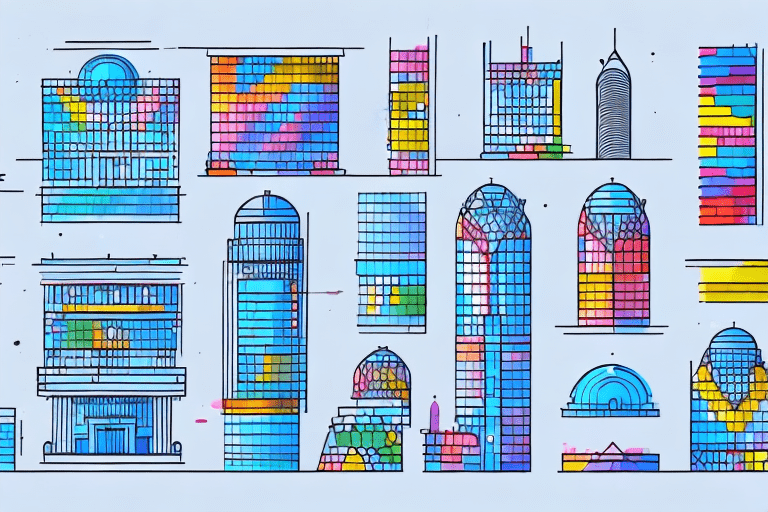
Color has the unique ability to transform spaces and impact the way we experience them. When used effectively, it can evoke specific moods and emotions and create a sense of harmony within a built environment. Research has shown that certain colors can induce feelings of calmness, while others can stimulate energy and creativity. By understanding how color affects human perception, architects and designers can create spaces that elicit desired emotional responses.
Moreover, color can influence our perception of spatial dimensions. Strategic use of warm and cool colors can create an illusion of depth and expand or contract a space visually. This knowledge can be leveraged to optimize the functionality of a room or an entire building.
Imagine walking into a room painted in soothing shades of blue and green. The cool colors immediately create a sense of tranquility and relaxation. This is why many spas and wellness centers incorporate these colors into their design. On the other hand, a vibrant red or orange accent wall can inject energy and excitement into a space, making it ideal for areas where creativity and productivity are desired, such as an art studio or a brainstorming room.
But it’s not just about choosing the right color; it’s also about considering the context and purpose of the space. For example, in a hospital setting, where patients may be feeling anxious or stressed, a calming color palette of soft blues and greens can help create a more soothing environment. Similarly, in a restaurant, warm and inviting colors like earthy tones or shades of red can stimulate appetite and create a cozy atmosphere.
It’s fascinating to think about how color can also influence our perception of space. By using lighter colors on walls and ceilings, architects can make a room feel more spacious and open. Conversely, darker colors can create a sense of intimacy and coziness, making a large room feel more intimate and comfortable. This knowledge is particularly valuable in urban planning, where the strategic use of color can help shape the perception of entire neighborhoods or cityscapes.
Furthermore, the impact of color extends beyond the visual experience. Research has shown that certain colors can affect our physiological and psychological responses. For instance, blue has been found to lower blood pressure and heart rate, while yellow can increase concentration and mental agility. By carefully selecting colors based on their physiological effects, designers can create environments that promote well-being and enhance performance.
In conclusion, color plays a vital role in the built environment. It has the power to influence our emotions, perception of space, and even our physiological responses. By understanding the psychological and physiological effects of different colors, architects and designers can create spaces that not only look aesthetically pleasing but also enhance the well-being and experience of the people who inhabit them.
Unlocking the Potential of Color in Architectural Design
Color has the potential to transform mundane spaces into extraordinary ones. When used purposefully, it can elevate the overall ambiance and aesthetic appeal of a building. By carefully selecting color palettes that complement the architectural style and intended user experience, architects can create visually striking designs that leave a lasting impression.
Architectural design should consider not only the immediate surroundings but also the larger context in which a building exists. The careful selection of colors should take into account the surrounding landscape, cultural significance, and historical context. This holistic approach ensures that the color choices align with the intended purpose and create a cohesive visual narrative.
When considering the surrounding landscape, architects must take into account the natural elements that will interact with the building. For example, a building located in a lush green environment may benefit from a color palette that incorporates shades of green to blend harmoniously with the surroundings. On the other hand, a building situated in an urban setting with a predominantly gray color scheme may call for bold and vibrant colors to create a striking contrast.
Cultural significance also plays a crucial role in color selection. Different cultures associate certain colors with specific meanings and symbolism. Architects must be mindful of these cultural connotations to ensure that the chosen colors resonate positively with the intended users. For instance, in some cultures, red is associated with luck and prosperity, while in others, it may symbolize danger or warning. Understanding these cultural nuances enables architects to create designs that are culturally sensitive and inclusive.
Furthermore, historical context can provide valuable insights into the color choices for architectural design. Historical buildings often have distinct color palettes that reflect the era in which they were built. By referencing these historical color schemes, architects can pay homage to the past while incorporating modern elements into their designs. This fusion of old and new creates a sense of timelessness and adds depth to the architectural narrative.
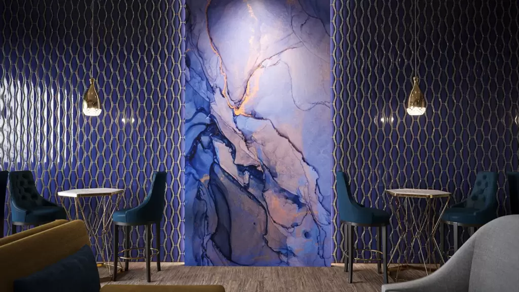
It is important to note that color is not just limited to paint on walls. Architects can explore various materials and finishes to introduce color into their designs. From vibrant glass panels to intricate mosaic tiles, the possibilities are endless. These unconventional applications of color can add layers of visual interest and create unique focal points within a building.
In conclusion, color is a powerful tool in architectural design. By considering the surrounding landscape, cultural significance, and historical context, architects can unlock the full potential of color to create visually captivating and meaningful spaces. Whether it is through subtle harmonization or bold contrast, the strategic use of color can transform a building into a work of art that resonates with its users and stands the test of time.
Examining the Role of Color in Shaping Spatial Perception
The perception of space is influenced by various visual cues, including color. The hue, saturation, and brightness of colors can create illusions of expansiveness or intimacy. In small spaces, the strategic use of light colors can make the area appear larger, while dark colors can create a cozy and intimate atmosphere. Similarly, in vast areas, the manipulation of color can help define zones within the space and guide the users’ movement.
Moreover, color can play a crucial role in wayfinding within architectural environments. By using different colors to highlight key areas or create visual markers, designers can enhance navigation and improve user experience. This is especially relevant in complex architectural layouts such as hospitals, airports, and large public buildings.
Understanding the Influence of Color on Aesthetics and Usability
Aesthetics and usability go hand in hand when it comes to architectural design. The careful selection and application of color can significantly impact both aspects. Colors should be chosen not only for their visual appeal but also for their functional value. For instance, in healthcare settings, soothing colors are often used to create a calm and restful environment for patients and staff.
Additionally, color can be used strategically to improve the usability of spaces. By using contrast and color coding, architects can differentiate between various zones and functions within a building. This promotes clarity and ease of use, reducing the likelihood of confusion or errors in navigation.
Investigating the Essential Elements of Color Theory
Color theory forms the foundation for understanding how colors interact with each other and how they can be used effectively in design. It encompasses concepts such as the color wheel, color harmony, and the psychological effects of different colors. Familiarity with color theory empowers architects and designers to make informed decisions when selecting color palettes for their projects.
The color wheel, a visual representation of the relationships between colors, provides a framework for creating harmonious color schemes. By employing complementary, analogous, or monochromatic color schemes, architects can achieve visual balance and create a cohesive design language.
Applying Color Theory Principles to Create Harmonious Spaces
When applying color theory principles in architectural design, it is essential to consider factors such as the function of the space, cultural connotations, and the desired emotional response. Certain colors may carry specific meanings or evoke cultural associations, which should be taken into account to create spaces that resonate with their intended users.
Harmonious color schemes can be achieved by carefully selecting colors that are aesthetically pleasing together and create a desired atmosphere. The use of color accents, contrasting hues, and tonal variations can add visual interest and depth to a design. By combining color theory principles with an understanding of the project’s requirements, architects can create spaces that are visually engaging and functionally efficient
Exploring the Role of Color in Enhancing Brand Identity
Color can be a powerful tool in branding. It has the ability to shape brand identity and evoke specific associations in consumers’ minds. When designing commercial spaces, architects often collaborate with marketing teams to incorporate brand colors and establish a consistent visual language.
Through the strategic use of color, architects can create environments that reflect the essence of a brand and reinforce its values. Whether it is a restaurant, retail store, or office space, the color scheme can help create a unique and memorable brand experience for customers and employees.
Analyzing the Benefits of Color in Creating Visual Interest
Color can be a powerful tool to create visual interest and draw attention to key elements within a design. By using bold and contrasting colors, architects can highlight architectural details, focal points, or points of interest. This technique can create visual drama and add depth to the overall composition of a space.
In addition to creating visual interest, color can also elicit emotional responses. Certain colors are inherently attention-grabbing, like vibrant reds or yellows, while others create a feeling of serenity, such as cool blues or soft neutrals. By strategically incorporating these colors, architects can influence the viewer’s perception and guide their focus within a space.
Examining the Relationship Between Color and Functionality
Functionality is a crucial aspect of architectural design, and color can play a significant role in enhancing the functionality of a space. By using color to differentiate between different zones or areas, architects can promote intuitive wayfinding and improve user experience. This is particularly important in large buildings or complex environments, where clear visual cues are essential.
Color can also be used to indicate functionalities or convey information. For example, in educational settings, color-coded rooms or signage can help students and staff quickly identify different departments or subject areas. Similarly, in healthcare facilities, color-coded materials or surfaces can indicate levels of cleanliness or safety protocols.
Discovering the Role of Color in Enhancing Visibility and Readability
The visibility and readability of architectural spaces are critical for their successful functioning. By using color to enhance contrast and legibility, architects can ensure that important information, signage, or graphics are easily visible and accessible to users.
For instance, high-contrast color combinations can make text or wayfinding signage stand out against the background, enhancing readability. Additionally, color can be used to highlight emergency exits, safety equipment, or navigational aids, improving the overall safety of a building.
In conclusion, the power of color in architectural design cannot be overstated. From influencing spatial perception and evoking emotional responses to enhancing aesthetics and functionality, color plays a pivotal role in shaping the built environment. By understanding the theories and principles of color and applying them judiciously, architects can create captivating spaces that not only fulfill their intended purpose but also leave a lasting impact on their users.

