Table of Contents
- Introduction to Color Psychology
- Color Theory Fundamentals
- Impact of Colors on Human Emotions
- Color in Residential Architecture
- Color in Commercial and Public Spaces
- Cultural Significance of Colors
- Trends in Color Usage in Architecture
- Color and Sustainability in Architecture
- Conclusion: The Future of Color in Architecture
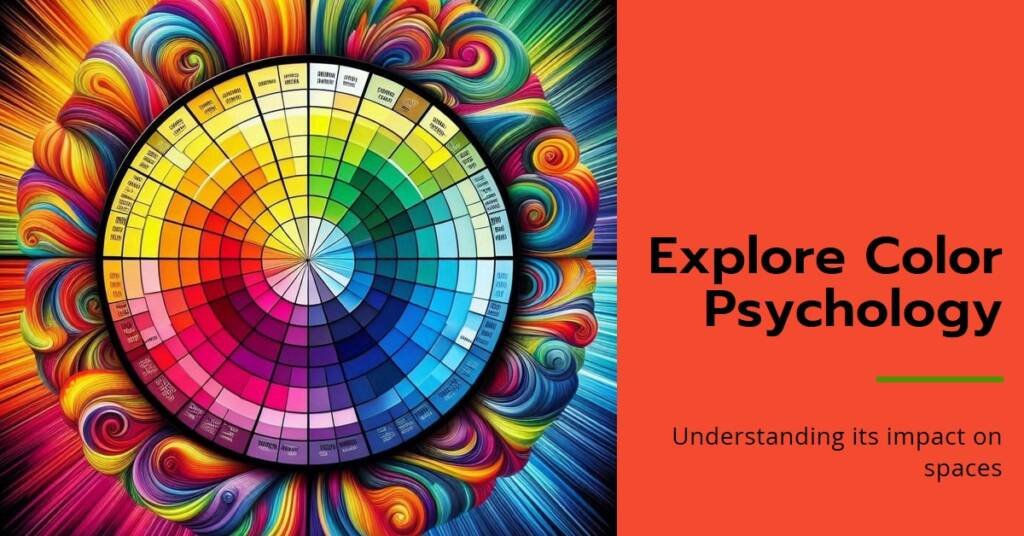
Introduction to Color Psychology
Color psychology is a fascinating field that examines how colors influence human emotions and behaviors. It is grounded in the understanding that colors can evoke specific reactions and feelings, impacting our moods and decision-making processes. The significance of color psychology extends beyond mere aesthetics; it is particularly vital in architectural design, where the choice of color can significantly shape the experience of a space.
The origins of color theory date back to the work of early researchers and artists who began to explore the relationships between colors and their effects on the human psyche. Notably, theories developed by figures like Johannes Itten and Wassily Kandinsky helped lay the foundation for our understanding of color’s emotional impacts. Today, color psychology is applicable across various fields, including marketing, art, and design, emphasizing its widespread relevance in modern society.
In architecture, the application of color theory plays a crucial role in creating spaces that resonate emotionally with their occupants. For example, warm colors such as reds and oranges can create a sense of warmth and intimacy, while cool colors like blues and greens often evoke calmness and tranquility. Recognizing these effects allows architects and designers to make informed choices, ultimately enhancing the overall ambiance and functionality of a building.
The interplay of color in architectural spaces is not only essential for aesthetic purposes but also fundamentally influences how people perceive and interact within those environments. By harnessing the power of color psychology, architects can design spaces that foster positive experiences, influence social interactions, and promote well-being among occupants. As a vital component of the built environment, understanding color psychology remains an indispensable tool for cultivating meaningful architectural experiences.
Color Theory Fundamentals
Color theory is a crucial aspect of understanding how colors interact and influence emotions within architectural spaces. At its core, color theory is divided into three main categories: primary, secondary, and tertiary colors. Primary colors include red, blue, and yellow; they cannot be created by mixing other colors. Secondary colors, which consist of green, orange, and purple, are formed by blending primary colors together. Tertiary colors arise from the combination of primary and secondary colors, resulting in hues such as red-orange or blue-green.
The color wheel is a valuable tool that represents these color relationships visually, making it easier to comprehend how different colors can complement or contrast with one another. This wheel is often utilized by architects and designers to create aesthetically pleasing and harmonious environments. Color harmony refers to the pleasing arrangement of colors, which can evoke certain feelings and reactions, thereby influencing human behavior and perception within a space.
When architects choose colors for a new building or renovation, they often consider the principles of color harmony while keeping cultural and contextual meanings in mind. For example, warm colors like reds and yellows can create a sense of energy and warmth, often associated with social gathering spaces. Conversely, cool colors such as blues and greens tend to promote calmness and serenity, making them suitable for areas intended for relaxation.
Understanding these fundamental principles allows architects to make informed color selections that align with the desired use and mood of a space. By adhering to color theory, architects not only enhance the aesthetic appeal of buildings but also play a pivotal role in shaping the experiences and emotions of the individuals who inhabit them.
Impact of Colors on Human Emotions
Colors play a significant role in shaping human emotions and behaviors, particularly within architectural spaces. The psychology of color informs us that various hues can invoke specific emotional responses, thereby influencing how individuals perceive and interact with their environment. For instance, blue is often associated with calmness and tranquility. Studies demonstrate that environments painted in shades of blue can lead to lowered heart rates and reduced feelings of anxiety. This makes blue a popular choice in spaces intended for relaxation, such as bedrooms and meditation rooms.
Conversely, the color red is known for its stimulating properties. It invokes feelings of energy and passion, which can lead to heightened emotions and increased heart rates. This vibrant hue is frequently utilized in spaces designed to encourage social interaction and excitement, such as restaurants and lounges. However, it is essential to strike a balance, as excessive use of red may result in feelings of aggression or anxiety in some individuals.
Green, a color that resembles nature, is linked to feelings of tranquility and balance. Research indicates that exposure to green environments can enhance feelings of well-being and reduce stress levels. This makes green an ideal choice for open spaces such as parks and wellness centers, fostering a sense of connection to nature which can positively influence mood and cognitive performance.
Similarly, yellow, often associated with happiness and optimism, is known to stimulate mental activity and encourage communication. However, it is worth noting that overly bright yellows can lead to feelings of frustration or irritability if not complemented by other tones.
In summary, the influence of color on human emotions through architectural choices is profound, highlighting the necessity for thoughtful consideration of color palettes in building design to create desired emotional impacts.
Color in Residential Architecture
Color plays a pivotal role in residential architecture, influencing not only the visual appeal of a home but also its spatial perception and the comfort experienced by inhabitants. The psychology of color suggests that different hues can evoke varying emotions and reactions, thereby affecting how individuals perceive their living environments. Warm colors, such as reds and yellows, tend to create a cozy and inviting atmosphere, while cooler shades like blues and greens can foster a sense of tranquility and relaxation.
Moreover, color choices can significantly enhance the livability of a space. For instance, in smaller homes, light colors often make rooms appear more spacious, creating an illusion of openness. A case study of a compact urban apartment highlights this effect; the use of pale blues and whites opened up the interiors, giving residents a sense of freedom and fullness. Conversely, darker tones can create an intimate setting, ideal for areas designed for relaxation, such as bedrooms. The choice of darker hues combined with strategic lighting can enhance the coziness of such spaces.
Personal identity and preferences also play a critical role in residential color choices. Many homeowners select colors that reflect their unique tastes, backgrounds, or cultural influences. A noteworthy example involves a family that chose vibrant, culturally significant colors for their living room. This not only made the space more visually stimulating but also served as a representation of their heritage, effectively bridging personal identity with architectural space.
Ultimately, the successful incorporation of color in residential architecture speaks volumes about the synergy between aesthetics and human experience. As demonstrated by various projects, careful color selection not only enhances the livability but also fosters a deep connection between the occupants and their home. By understanding the psychological impacts of color, architects and homeowners can create harmonious environments that nurture both comfort and identity.
Color in Commercial and Public Spaces
The use of color in commercial buildings and public spaces plays a significant role in shaping the perception and behavior of individuals within these environments. Colors can evoke emotions, influence decisions, and create distinctive atmospheres that either attract or deter consumers. Retail spaces, in particular, utilize color strategically to enhance brand identity and drive sales. For instance, a vibrant red may be used in a fast-food restaurant to stimulate appetite and urgency, while cooler hues such as blue can create a sense of calm, often found in spas or healthcare facilities.
In offices, the choice of color can impact employee productivity and satisfaction. Warm colors, like yellows and oranges, may foster creativity and collaboration, while blue hues are often associated with focus and concentration. An effective color scheme in an office space can motivate employees and improve their overall work experience, highlighting the importance of thoughtfully selected palettes in these environments.
Public spaces, including parks, libraries, and community centers, also benefit from the intentional use of color. Designers often select colors that resonate with the intended purpose of the space. For example, greens and earthy tones can promote relaxation and a connection to nature, which is particularly important in urban parks. Additionally, vibrant colors can energize public areas, making them welcoming and encouraging social interactions among visitors.
Ultimately, the psychological impact of color in commercial and public spaces should not be underestimated. By choosing appropriate color schemes, designers and business owners can influence consumer behavior, enhance brand identity, and create a memorable experience for all visitors. To succeed in these environments, a careful balance of colors that resonate with the desired atmosphere is essential.
Cultural Significance of Colors
The significance of colors is profoundly intertwined with cultural contexts, where meanings can shift dramatically from one region to another. Within architectural spaces, this variability in color interpretation necessitates careful consideration by architects and designers to ensure their choices resonate positively with the intended audience. Different cultures assign distinct meanings to specific hues, which can influence emotional responses, societal norms, and even traditional practices. For example, while white is often associated with purity and cleanliness in Western cultures, it may symbolize mourning in some Asian traditions.
This cultural differentiation is particularly relevant in projects that engage multicultural communities or seek to express cultural heritage. Architecturally, colors can enhance a sense of belonging or alienation, depending on how they align with the collective memory and emotional associations held by a community. Colors like red can symbolize fortune and happiness in Chinese culture, whereas, in some African cultures, they might represent danger or conflict. Understanding these nuances is essential for architects to create spaces that are not only aesthetically pleasing but also culturally sensitive and relevant.
Moreover, colors interact with the built environment in ways that reflect cultural identities and traditions. The use of vibrant colors may evoke a sense of celebration and joy in regions rich in cultural festivities, while muted tones might convey tranquility and introspection in others. Consequently, it is vital for architects to engage with cultural consultants or conduct thorough research to comprehend the local significance of colors in their design processes. Such an approach not only fosters respect for cultural diversity but also enriches the architectural narrative, thereby enhancing the overall experience within the space.
Trends in Color Usage in Architecture
In recent years, the application of color in architectural design has undergone significant transformations, reflecting broader social, technological, and environmental trends. One prominent trend is the use of soothing, muted color palettes that foster a sense of calm and well-being. Shades of soft blues, greens, and earthy tones have gained popularity, aligning with the contemporary emphasis on creating tranquil living and working environments. These colors are not only aesthetically pleasing but also promote a positive psychological impact on inhabitants.
Another important trend involves the integration of sustainable materials and their natural colors into architecture. Designers are increasingly utilizing materials that are environmentally friendly and visually appealing. For instance, reclaimed wood, recycled metals, and stone are being incorporated into modern structures, showcasing their inherent hues. This shift towards sustainability is reflective of a growing societal awareness regarding the importance of environmental conservation, thereby influencing color selections that resonate with this idea.
Technological advancements are also shaping color application in architecture, introducing innovative methods for color interaction and illumination. Dynamic color-changing LED lights enable architects to modify the color schemes of a space instantaneously, allowing for greater flexibility in design. Furthermore, smart glass technology, which adjusts transparency and tint based on environmental factors, is becoming an essential element of modern architectural elements. This evolving interplay between technology and color not only enhances aesthetics but also improves energy efficiency and functionality in architectural spaces.
As the field of architecture continues to evolve, the trends in color usage are becoming increasingly vital in defining spaces that are not only functional but also psychologically uplifting. Understanding these contemporary trends can assist architects and designers in creating environments that respond to current societal needs while maintaining a distinct and appealing visual identity.
Color and Sustainability in Architecture
In contemporary architectural practices, the integration of color is increasingly being recognized not only for its aesthetic appeal but also for its significant contributions to sustainability. Color has the power to influence various aspects of energy efficiency, materials conservation, and the ecological impact of buildings. Architects and designers are now focusing on how strategic color choices can enhance the environmental performance of their designs.
One primary way color contributes to energy efficiency is through its effect on heat absorption and reflection. Lighter colors, for instance, tend to reflect sunlight, thereby keeping buildings cooler in hot climates and reducing the need for air conditioning. Conversely, darker shades can absorb heat, which may be beneficial in cooler regions, thus minimizing heating requirements. These decisions are increasingly guided by climate considerations, ensuring that colors chosen for building exteriors align with sustainability goals and help reduce energy consumption.
Furthermore, sustainability in architecture extends beyond energy efficiency; it encompasses the entire lifecycle of materials. Colorants and finishes chosen for structures must not only be visually appealing but also environmentally responsible. The use of non-toxic and sustainable pigments aligns with green building certifications such as LEED (Leadership in Energy and Environmental Design). When architects prioritize eco-friendly paints and finishes, they minimize harmful emissions associated with conventional materials, leading to healthier indoor environments.
Additionally, the choice of color plays a role in enhancing the longevity of materials. Certain colors can reduce the aging effects of sunlight on exterior surfaces, thereby extending maintenance cycles and reducing the frequency of repainting or refinishing. This aspect of sustainability not only conserves resources but also reduces the overall environmental footprint of architectural projects.
Conclusion: The Future of Color in Architecture
In recent years, the integration of color psychology into architectural practices has gained significant attention. As we have discussed, color plays a critical role in shaping our experiences within built environments. Its influence extends beyond aesthetics, affecting our emotions, behaviors, and overall well-being. Consequently, architects must consider the psychological effects of color when designing spaces to create environments that foster specific emotional responses and enhance functionality.
Moving forward, the future of color in architecture is likely to evolve as our understanding of color psychology deepens. Advances in research will continue to illuminate the complex relationships between color, emotion, and spatial perception. Architects who are attuned to these developments will be better equipped to utilize color strategically, thus enhancing the user experience in various settings, from residential to commercial and public spaces.
Moreover, the rising awareness surrounding mental health and well-being presents a unique opportunity for architects to prioritize the psychological implications of color choices. By engaging with the principles of color psychology, architects can design spaces that promote calmness in healthcare facilities, foster creativity in educational environments, and inspire collaboration in workplace settings. In this regard, the proactive application of color psychology can lead to profound shifts in how spaces are perceived and utilized.
Ultimately, as the field of architecture continues to advance, embracing an interdisciplinary approach that incorporates insights from psychology will be essential. By doing so, architects can create more meaningful and impactful environments that resonate with the diverse needs of individuals and communities. The conscious use of color, informed by psychological principles, will undoubtedly shape the future of architectural spaces, leading to enhanced experiences and improved quality of life for their occupants.